take a peek 👀 ↴
© Andrew Simon and affiliated parties.
All rights reserved.
About

Andrew Simon is a dangerously creative, design thinking, artistic individual with a keen eye for detail. A content creator of 10 years and multidisciplinary designer of 7 years, his passion for creating and producing online media brought him to study Information Design at Mount Royal University to better understand the function, understanding and intricacies of designing products and crafting content.His study of esports, gaming and new media curation over the last decade lends an objective understanding of web content, new digital frontiers, analytics and audience retention. His journey has brought him to lead varying creative design teams and take on an Instructor role teaching Effective Communications at Mount Royal University.Andrew practices a myriad of approaches within Creative Design, Information Design and Content Creation: Information Architecture, UX / UI Design, Graphic Design, Typography, Ethnography, Content Curation, Memetic Understanding, Post Production and New Media Broadcasting. Each approach fits into a relative design process to conceptualize, consider, construct and complete.
creative design & events
battlebox
gaming trailer
VBR Resurrection
2022
Speedrunner
Series by Shaw
HyperX
Loot Drop II
Canlan
Chelenge
7-Eleven Game
Time Anytime
Collegiate
Champs Series
acac collegiate
smash 2020
Salt Flats
2020
commonwealth
canada jerseys
Pinnacle
2021
Jack Link's Wild
Side Rumble
TGS Outpost
at FanExpo YVR
IIHF World Jrs
Deke the Halls
HyperX Hockey
Challenge
Edmonton
Direct
Salt Mines
2021
Canada Cup
2019
information design
logos & branding
(mis)information
an infographic for our time
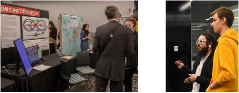
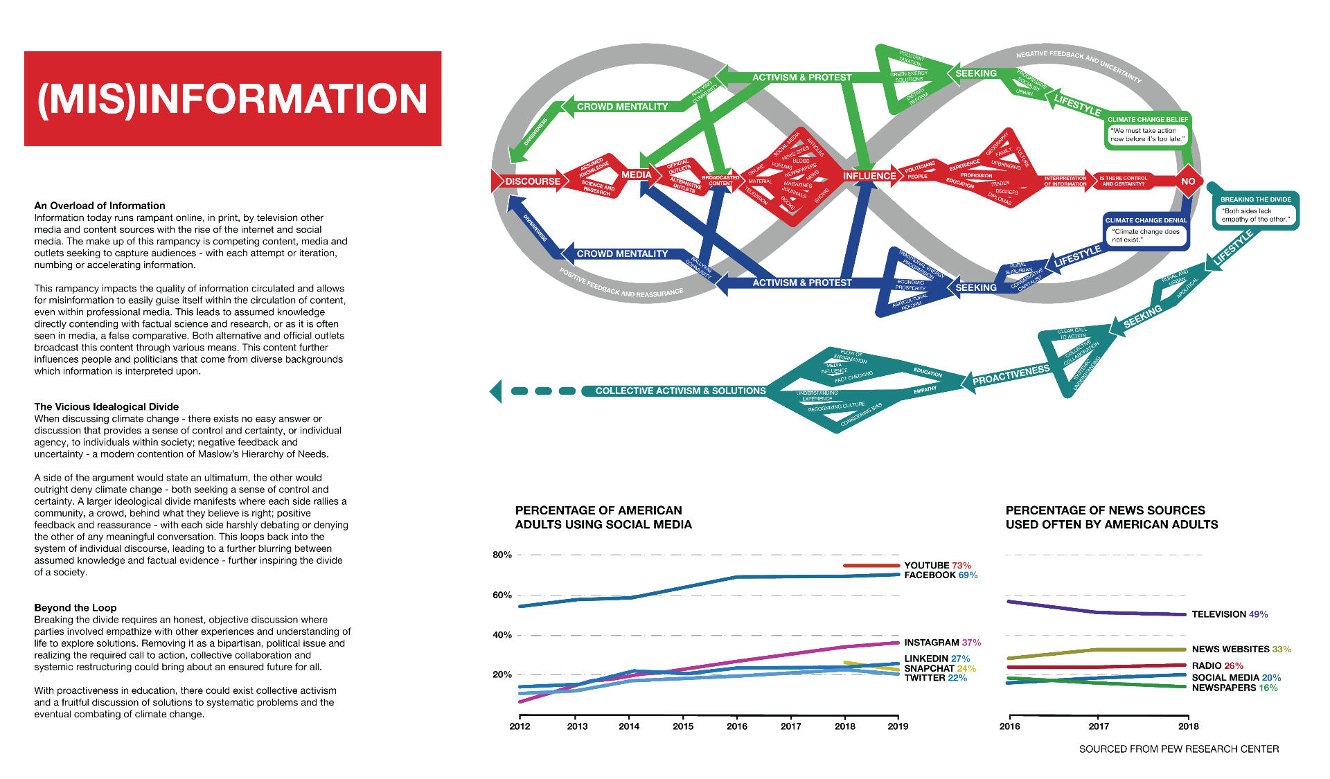
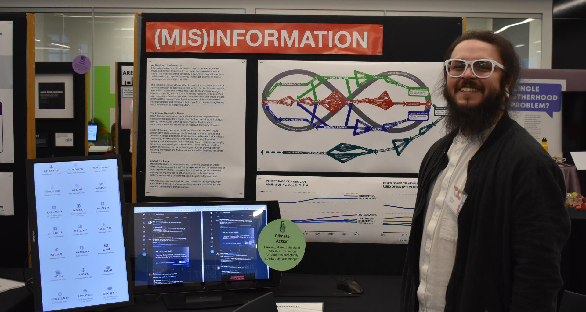
An Infographic featuring a system map which demonstrates the current flow of modern information correlating with the rise of news and media alternatives, primarily in that of social media. Now, more than ever, societies are dealing with a rampant acceleration of information with the coming of social media - straining individuals and their ability to understand, disseminate and consider information and misinformation guised as being factual.Data and research would suggest the flow of information and how people perform activism is consistently looping - with education, empathy and understanding being the only possible reform to shift of close ideological divides.
intercultural communications
an origin story
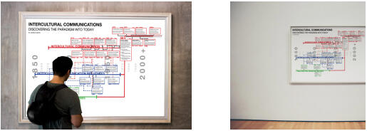
A timeline regarding the development of Intercultural Communication as a discipline. Research and data collection emphasizes the surrounding studies regarding modern paradigmatic understanding and experiences to build out a coherent, hierarchically understood timeline and convergence of elements within the field of intercultural communications.This timeline grows today into the present day as the field of Intercultural Communications broadens and emboldens.
reimagining the kerby centre
go outside and play! (It's good for you!)
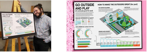
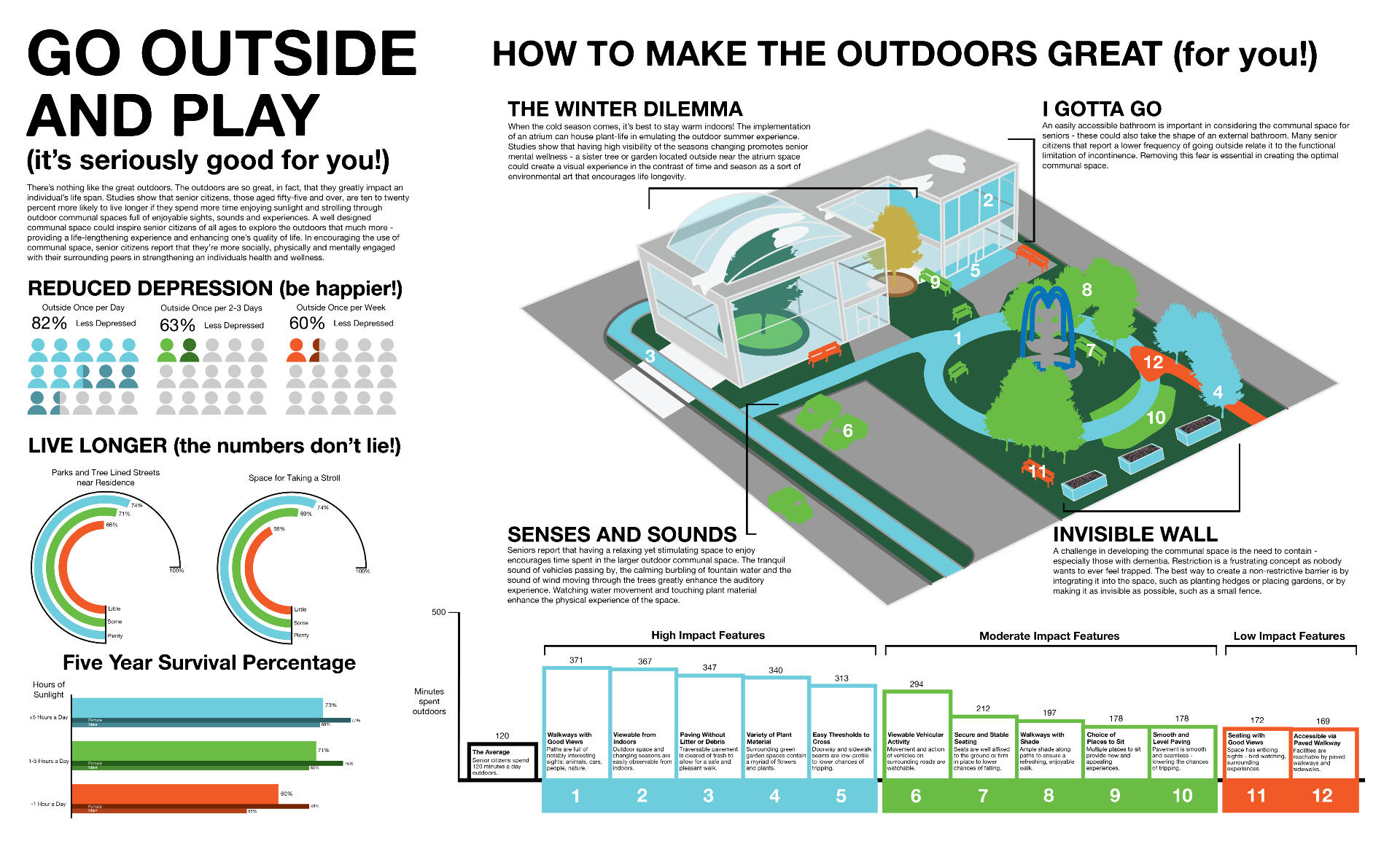
An Infographic of a suggested design for the new Kerby Centre facility in Calgary, Alberta. Data suggested that seniors who had freedom and space to be outdoors or among nature have a higher level of happiness and wellbeing. The design explored impact features and resistances that seeked to explain what features within a space increased the average time spent outdoors.Canadian specific features were explored such as that of “inviting the outdoors” indoors via smaller indoor park area and plenty of windows for the colder seasons.
a modern educational space
reimagining the MRU communications lounge
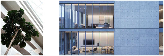
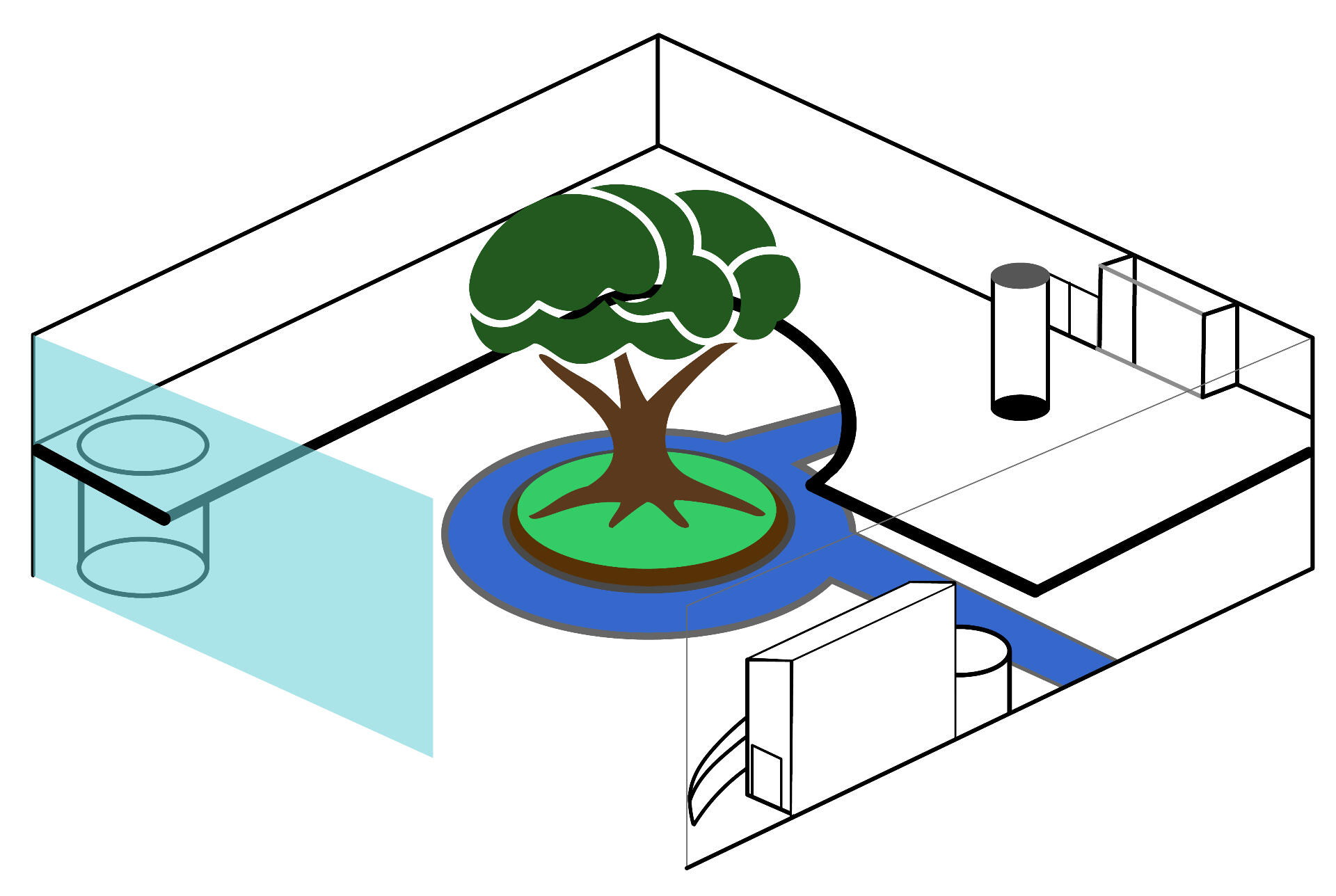
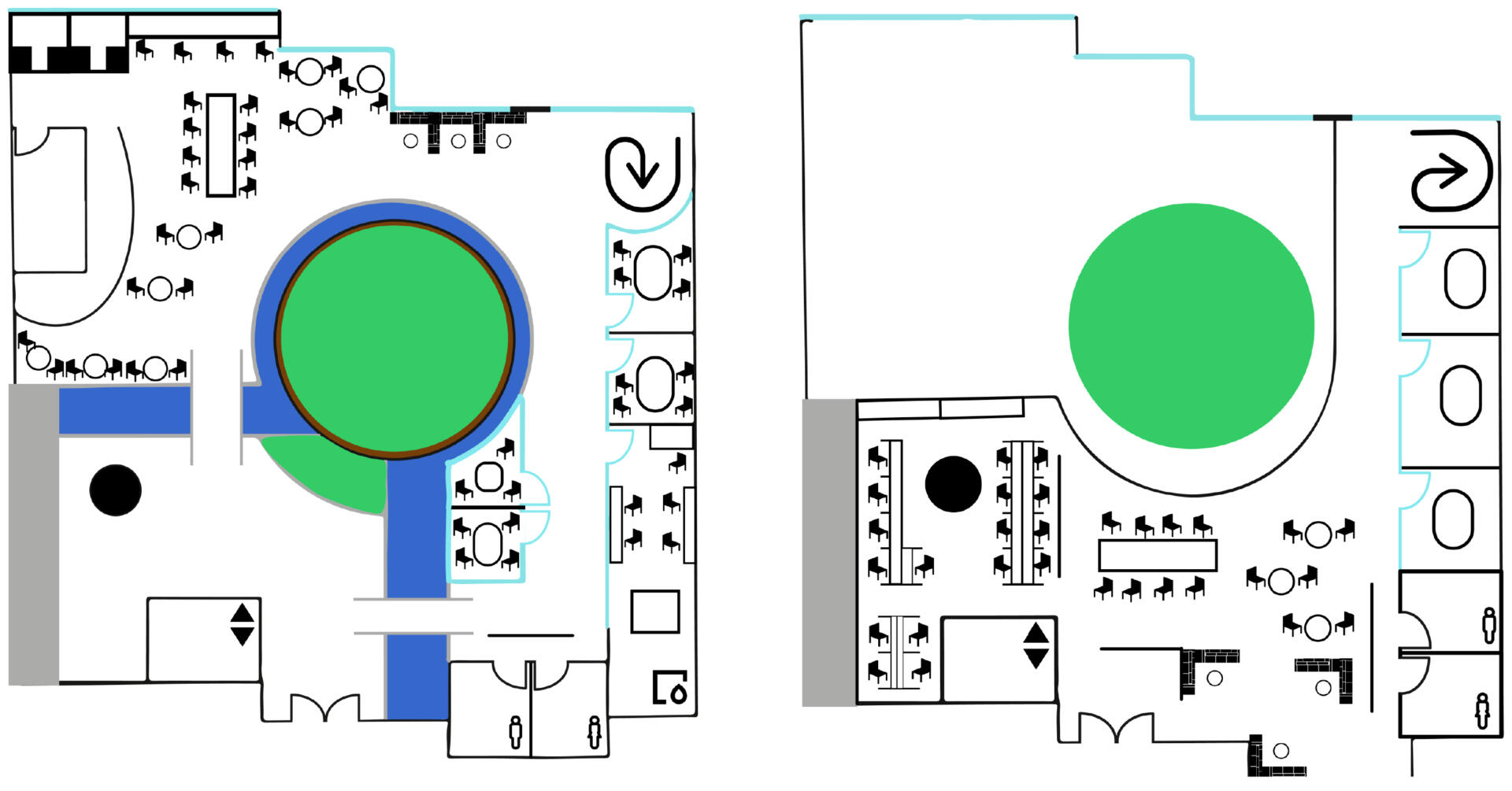
An abstract redesign and reconstruction of the current Communications study, learning and leisure space available at Mount Royal University. The design suggests a tear down of the traditionally separated first floor - broadcasting space - and the second floor, general communications space, to create a contemporary communication student space centred around an indoor park space, a cafe space, specialized print and design spaces, and lofted study spaces on the second floor overhang.The tear down of the traditional wall for a glass wall would further emphasize the living nature; the inviting of natural light into the educational environment.

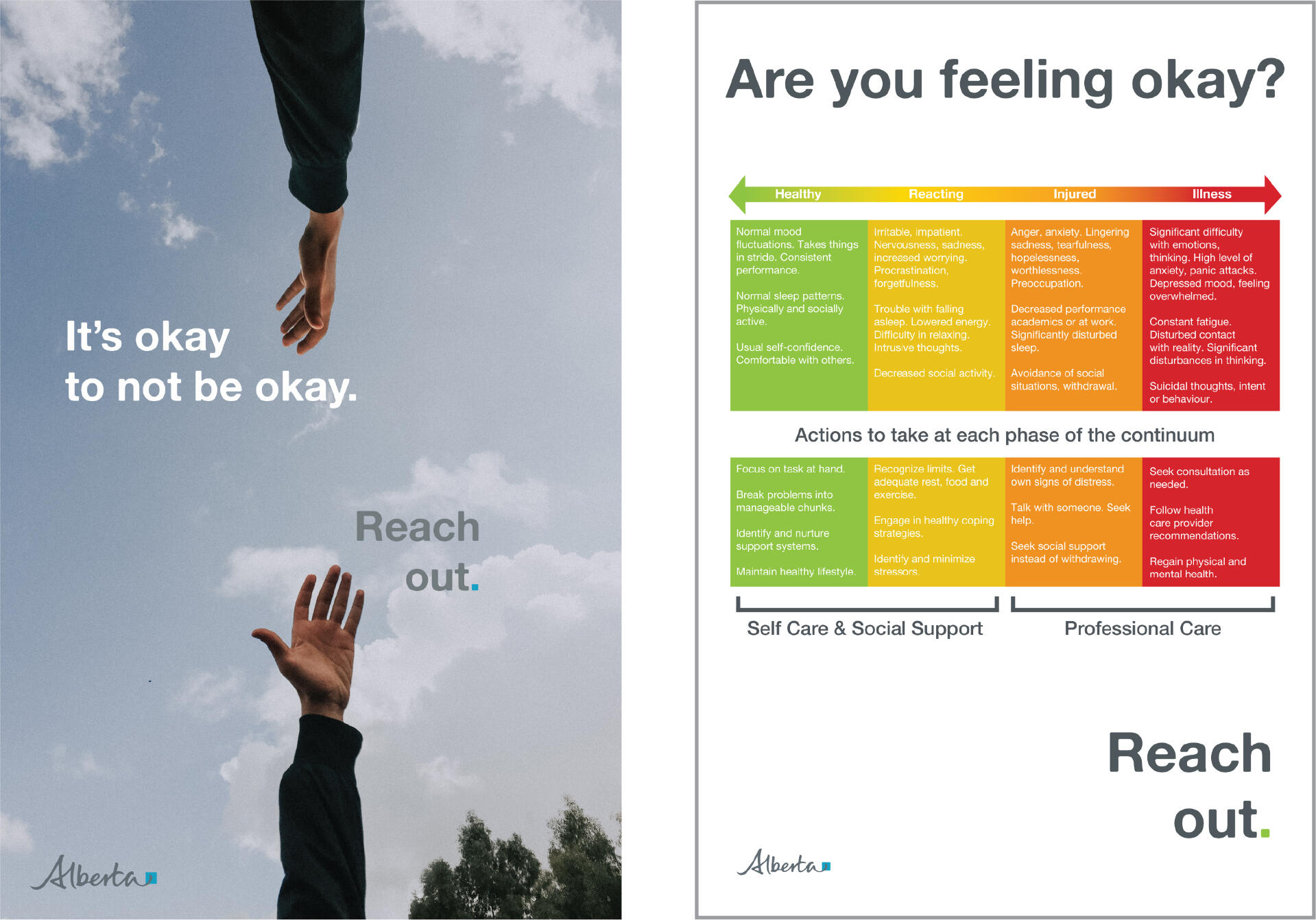
cps: it’s okay to not be okay, reach out
calgary correctional peer support awareness
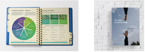
Peer support posters and accessible peer support resources for Calgary Correctional Facility Officers. A specialized CCF Peer Support binder was passed off as a resource - being mildly outdated and inaccessible. This peer support resource was entirely overhauled, updated and redesigned to be more visually engaging and readable. Posters were designed to reflect the outreach of the overhauled resource: “It’s okay to not be okay. Reach out.”This would seek to encourage those silent about their deteriorating mental wellbeing or encouraging those feeling vulnerable to ask for help within the workplace.
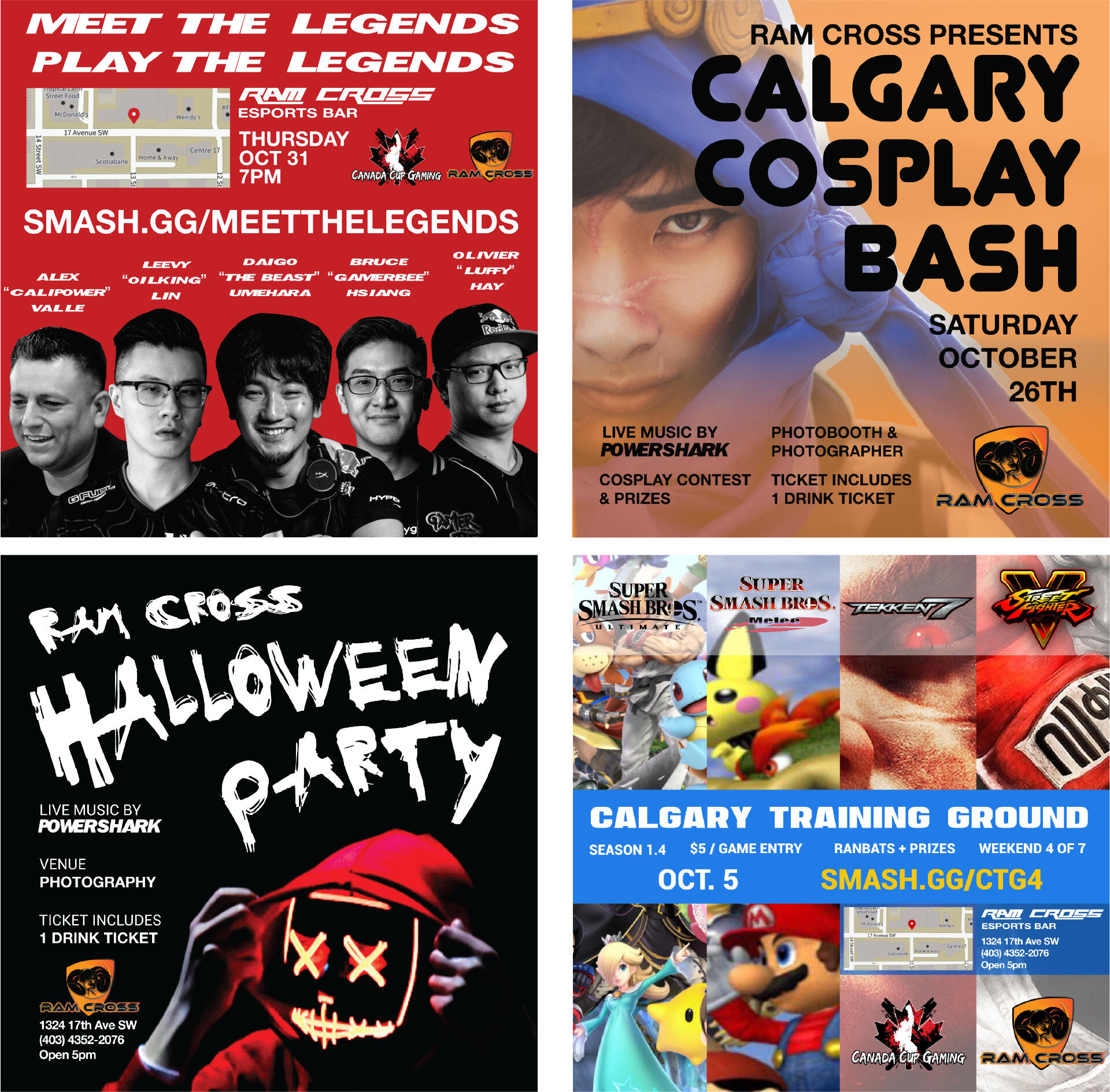
ram cross: creating community
connecting to the intended gaming audience
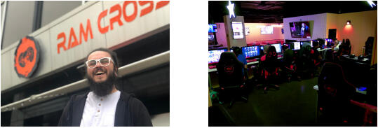
A temporary community management, social media management and development position. Ram Cross was an esports bar looking to better connect with its intended audience: gamers. A small logo upgrade and branding assets were developed alongside a social media content calendar in attracting an audience online and through the use of new media.Content curation and event development sought to excitedly bring in a community interested in video games, esports and entertainment. Various feedback would be used to continue developing the brand identity in understanding and catering to audiences both new and old.
portfolio:
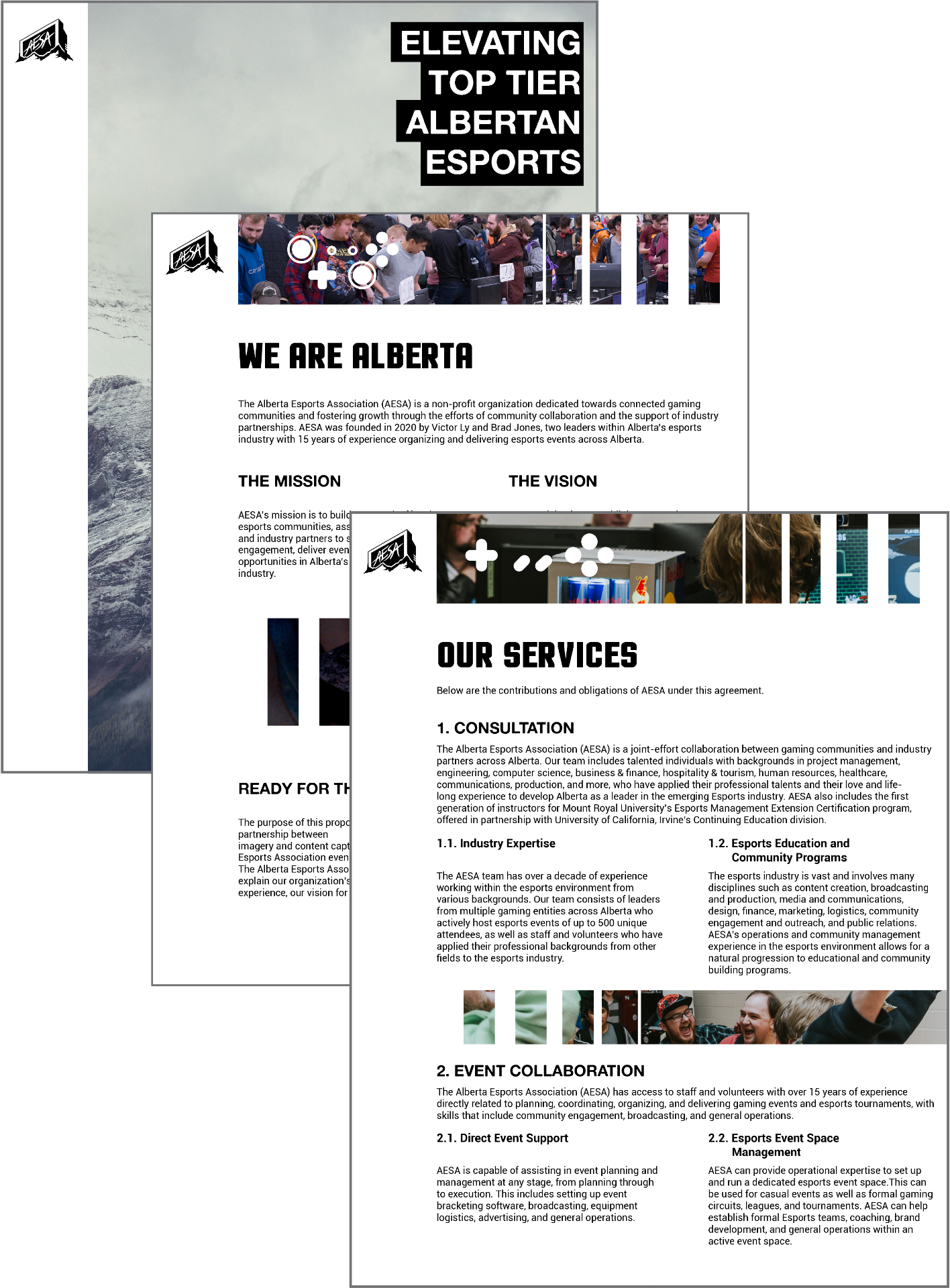
alberta esports association
creating the vision

Portfolio development used alongside proposals. Acts as a visual representation of brand cohesiveness fitting the style guide for the association. Communicates the objectives, vision and effort of the collective as a non-profit body looking to represent esports in Alberta, Canada. Uses original imagery and content captured throughout Alberta Esports Association events and efforts.Uses original imagery and content captured throughout Alberta Esports Association events and efforts.esportsalberta.ca

mru health & wellness style guide
ensuring consistency across formal documents

A developed style guide for Mount Royal University Mental Health and Wellness Services. Style guide considers design conventions, writing conventions, number conventions, purpose and identification in creating unity across all Wellness Service documents. A formally designed document that contains all appropriate information with each label properly placed within its appropriate label and part.The style guide itself demonstrates a considered use of hierarchy and composition within its proposed structure and design conventions.

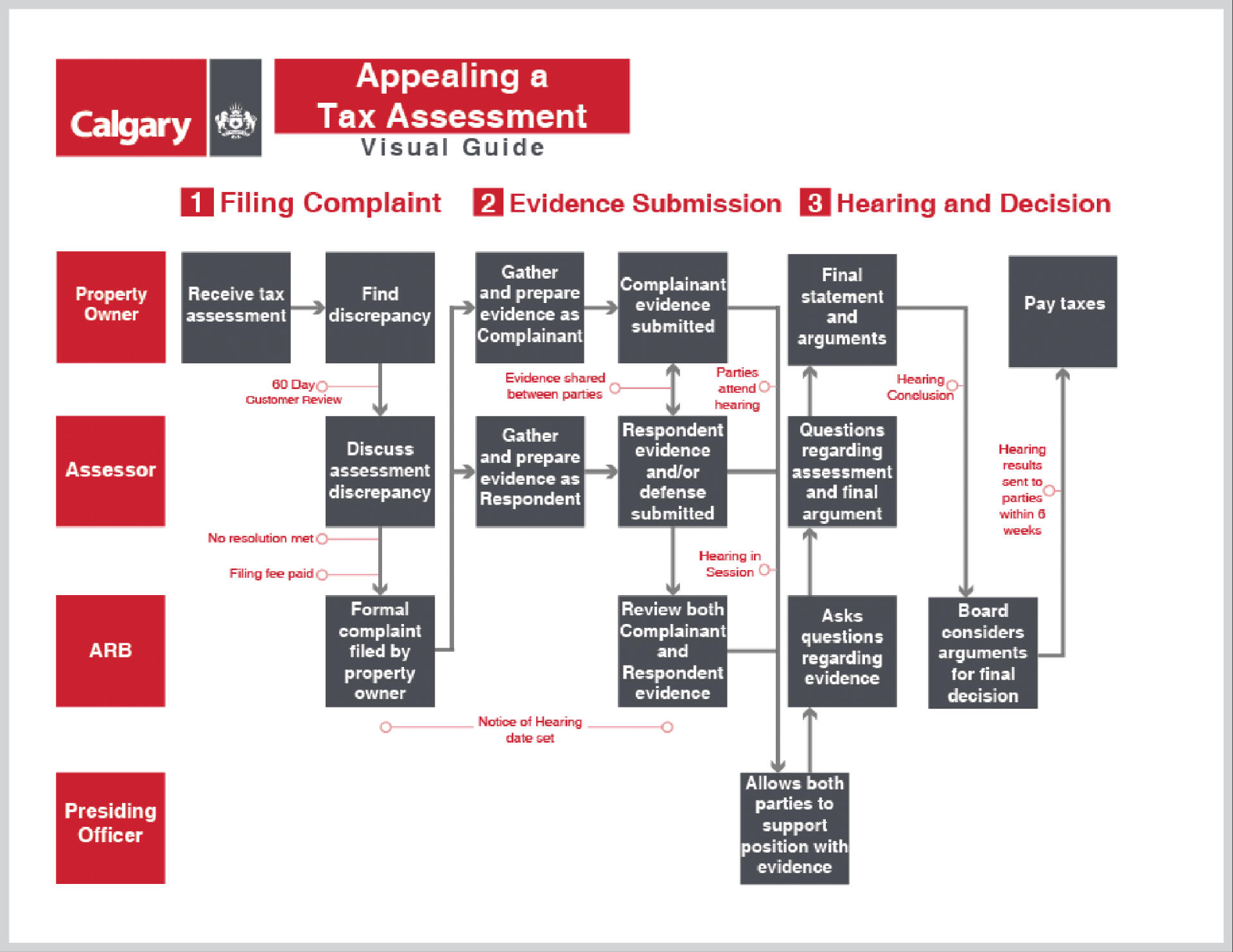
yyc: appealing a tax assessment
omitting uselessness within the process

A developed document used to better communicate the process of appealing a tax assessment - including a visualized flowchart of said process. Information is provided directly from the City of Calgary website, for citizens of the city. The development of this document considers information architecture elements: layout, properly structured information blocks, hierarchy and gestalt principles.Provided information synergized and formed into engaging, understandable, readable blocks of information to fit the form of 3 pages – 2 pages including a flowchart. Usability takes precedence in developing instruction throughout the process. Formality was absolute in developing this document to assure alignment and consistency with the professional brand standards of the City of Calgary.
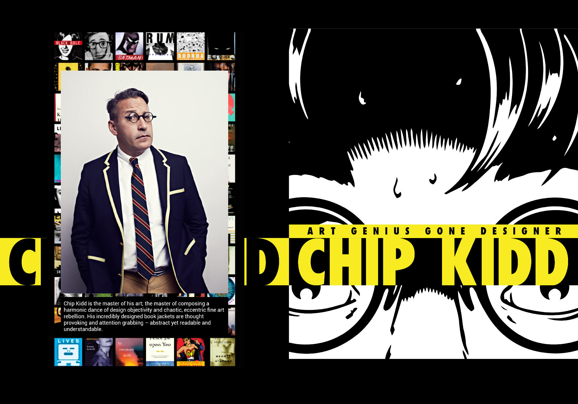
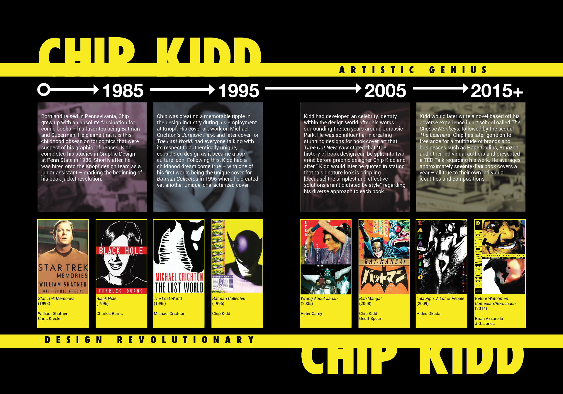
chip kidd study booklet
inside the design mind of another

Study, consideration and recreation of the aesthetic or stylistic design choices of Chip Kidd into a double sided spread. Research and content is developed to discuss the journey of Kidd and his development as a creative. Spreads are developed with consideration to the comic book series “The Watchmen” as it is one of Kidd’s notable pieces of work in developing the cover of the comic.Timeline content depicts the journey of his designed cover work and addresses notable moments within his design career.
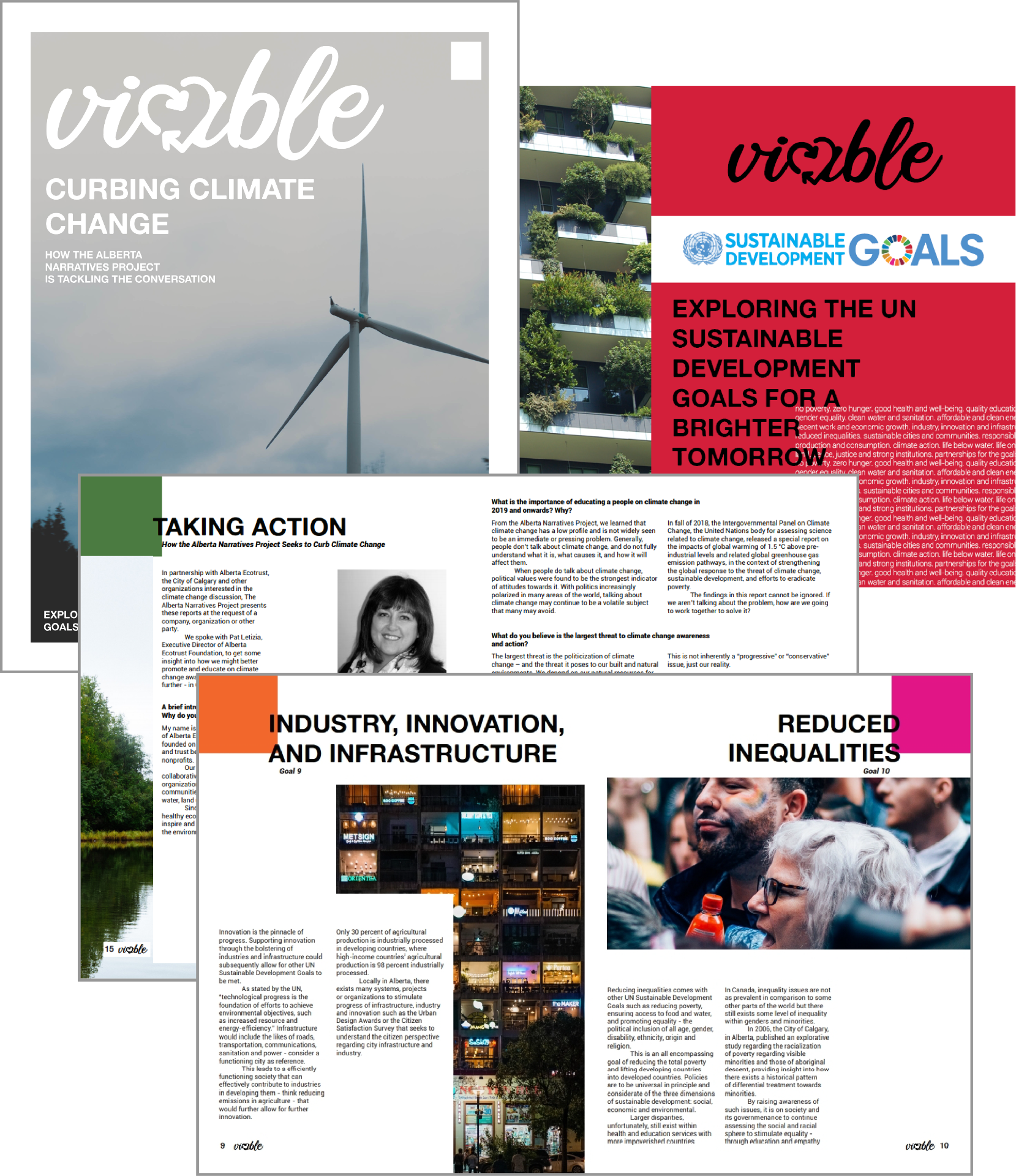
viable: sustainable development
exploring goals for a brighter tomorrow
Viable - a magazine dedicated to discussing The 17 Goals in Sustainable Development proposed by the United Nations. Branding developed to reflect the nature of sustainable development - typographic styling surrounding a heart shaped recycle logo. Research of each topic constructs the technical writing pieces and articles throughout the magazine in creating an engaging and educative reading experience.The magazine also features an exclusive interview discussing the UN Goal of addressing climate change with a local subject matter expert. Magazine design asserts hierarchical and considered principal in the development of content with a modern aesthetic.
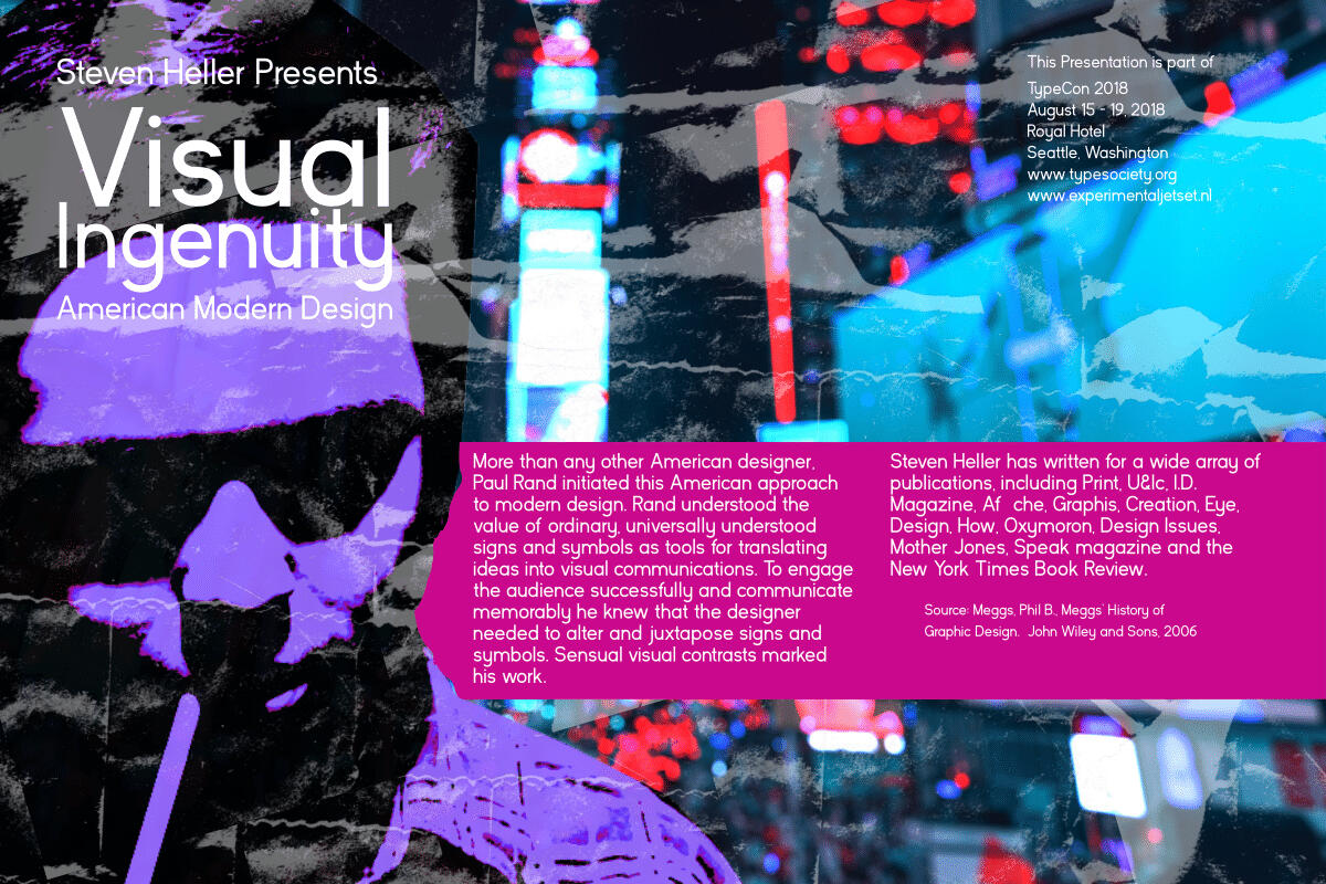
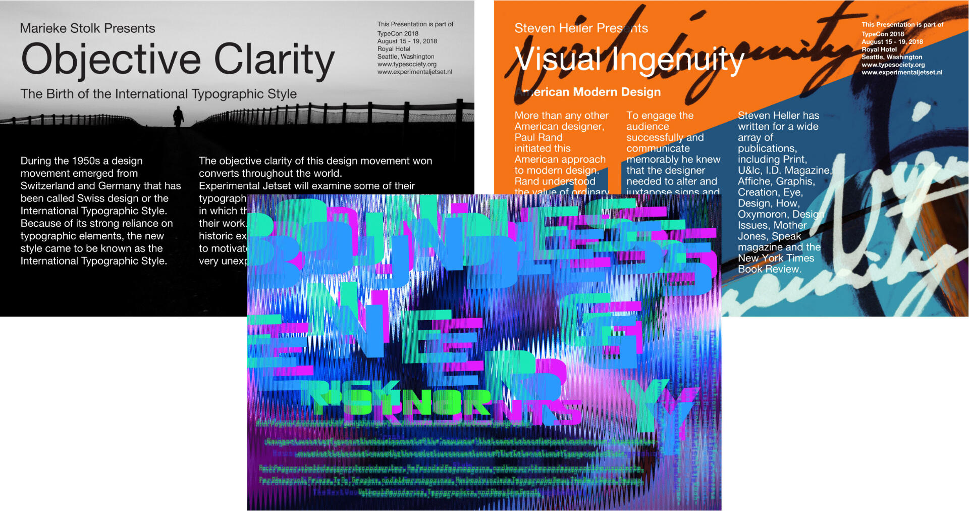
stylistic postcard design
exploration of design aesthetics
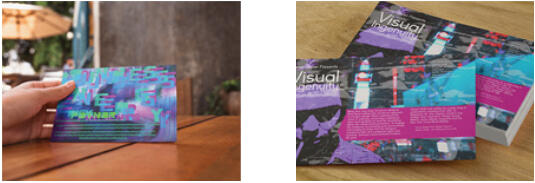
A demonstration of understanding design function and the ability to be stylistically fluid or agile. Three postcard designs defined by their assigned style: Objective Clarity in an International Typographic Style, Visual Ingenuity in American modern design and Boundless Energy in post-modern design.The intent of the project was also to experiment with set text - tinkering with connotation and denotation in layout; to communicate a clear, legible idea or to evoke emotion and disregard legibility through a heavier emphasis on visuals.
gobrinz: adventures in new media
a decade long exploration of internet content
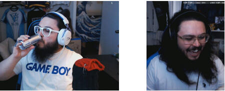
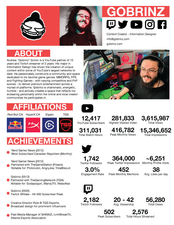
An adventure in new media. The online persona of Andrew since 2011. Gobrinz was once the host of Nerd Gamer News, a gaming news show exclusively on YouTube. Nerd Gamer News was a partner of The Game Station (now Polaris). The show was discontinued in 2015 when Gobrinz decided to focus on more niche gaming content, in partnership with The Gaming Network at the time. In 2017, he decided to transition experiment in livestreamed content gaming content.Today, he streams select games throughout the week as an independent influencer. He continues to upload livestream highlights, reviews and specials on YouTube.**Active projects seen on **gobrinz.com.
canada cup 2019
broadcasting one of canada’s top esport event

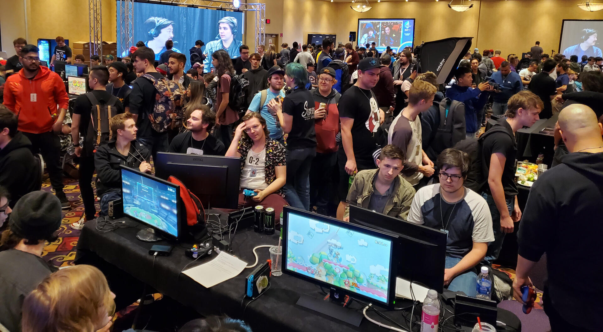
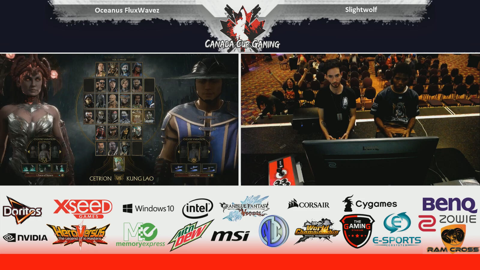
A broadcasting opportunity for one of Canada’s biggest esports events. The Canada Cup Gaming team required additional live streaming resources to run a smooth broadcast over the weekend. Assets were delivered and constructed to be used for the secondary broadcast of Canada Cup 2019.Equipment and expertise were provided through the entirety of the tournament - adapting quickly to change when technical errors arise; acting agile within a strict broadcast schedule.watch here
#CCGX DBFZ Special Brian Drummond vs Peter Kelamis
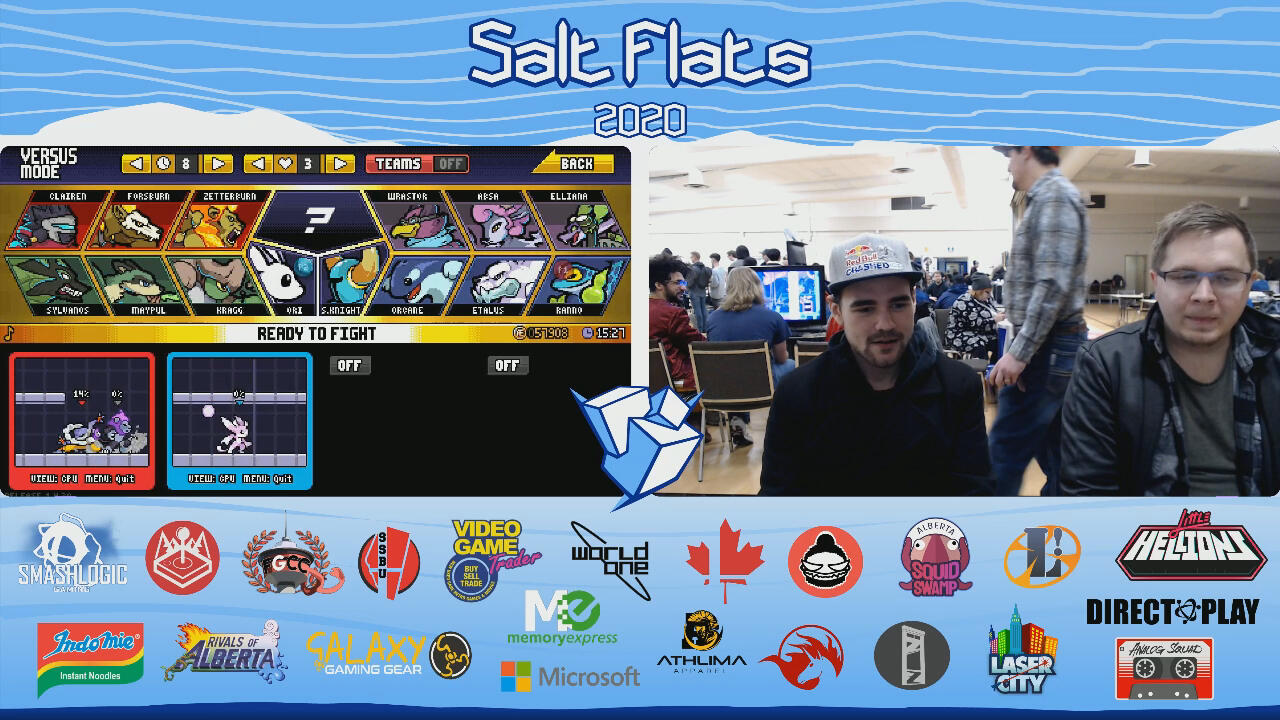
salt flats 2020
broadcasting calgary’s top esport event

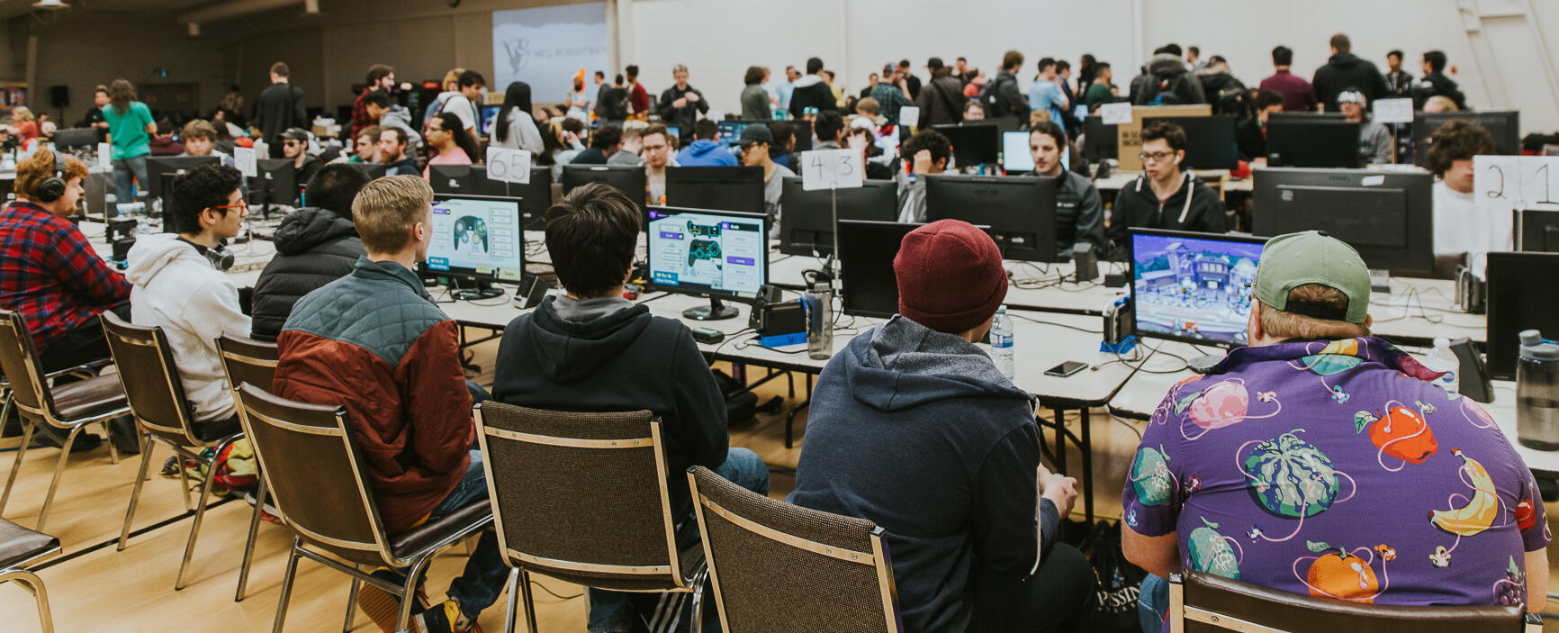
Asset development and a broadcasting opportunity for one of Calgary’s largest esports events. Broadcast and stream assets were developed for livestreaming the tournament over the weekend.Equipment and expertise were provided through the entirety of the tournament for a myriad of gaming consoles, specific brackets and necessary setups for tournament games - including a room wide game of rock paper scissors.watch here
Salt Flats 2020 - Super Smash Bros. Ultimate Top 8
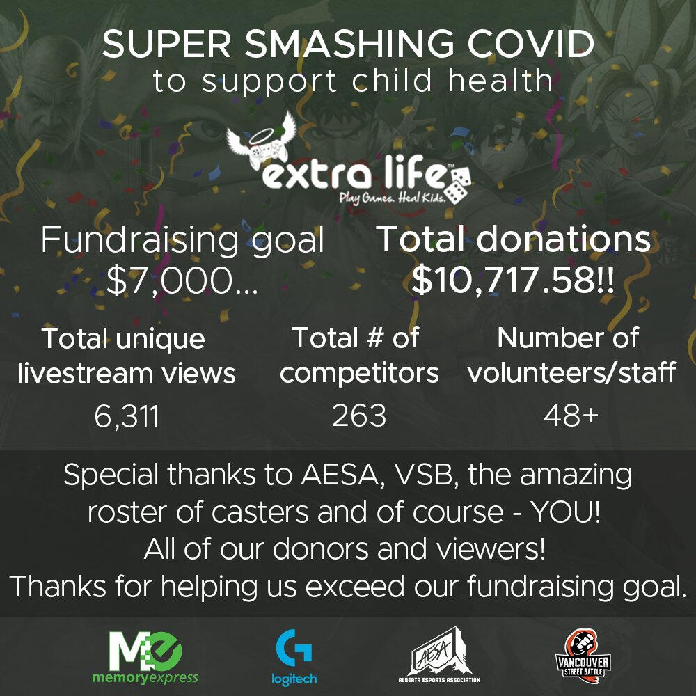
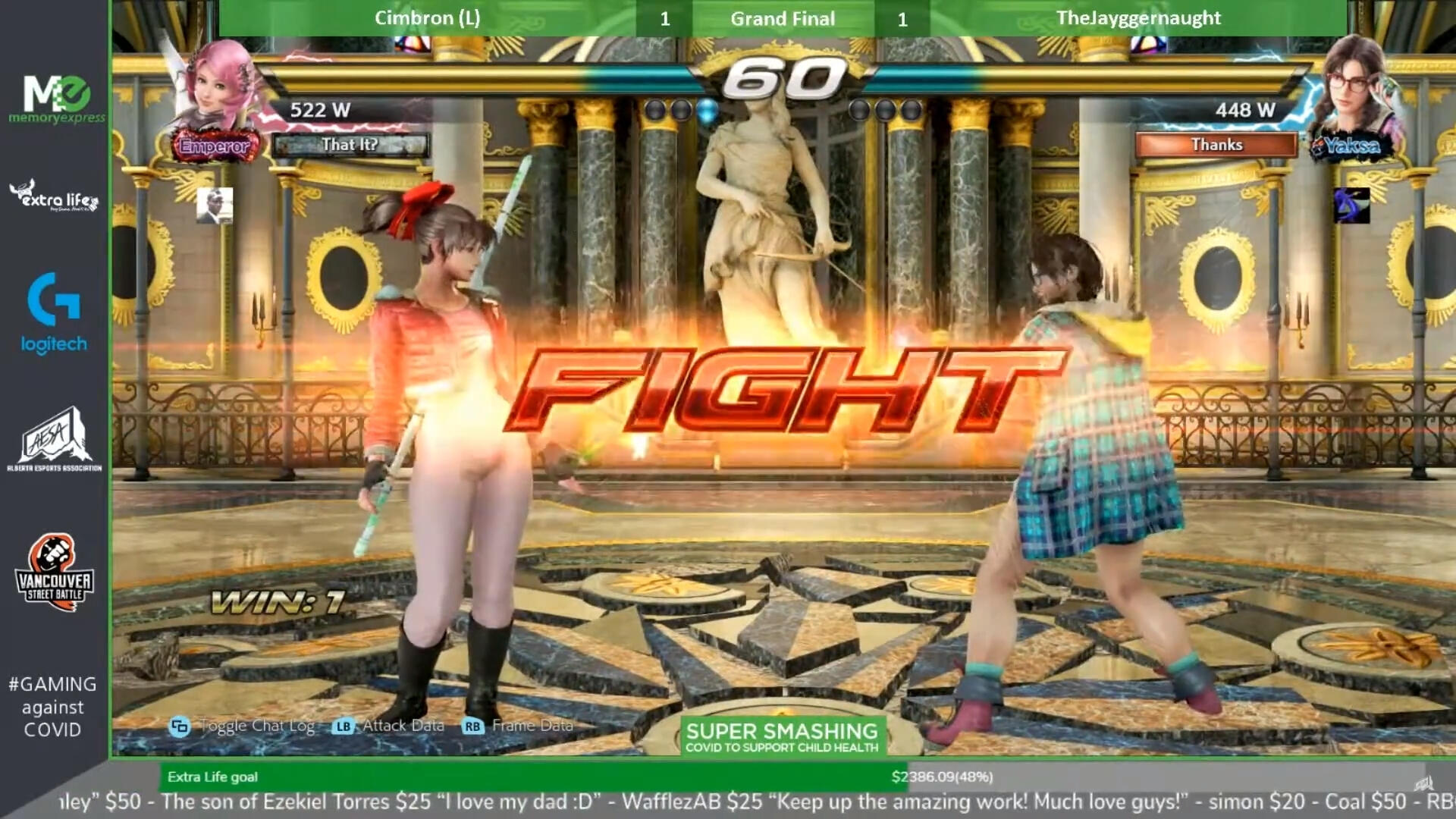
super smashing covid 2020
local esports for a good cause

Broadcast and production for Memory Express’ first online esports fundraiser in collaboration with the Alberta Esports Association. Developed content assets and produced highlight reel - followed by tournament archival via Alberta Esports Association social media.Provided continued expertise and advisory throughout the event: coordination, equipment and online troubleshooting.watch here https://youtu.be/u63Rz_scv8A
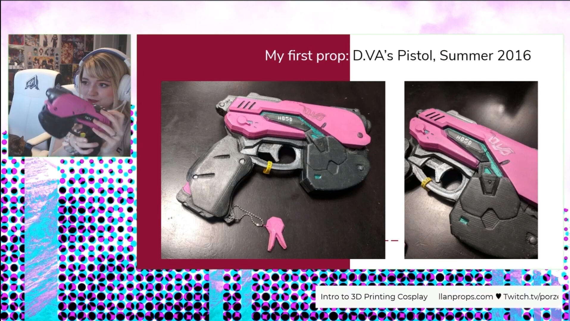
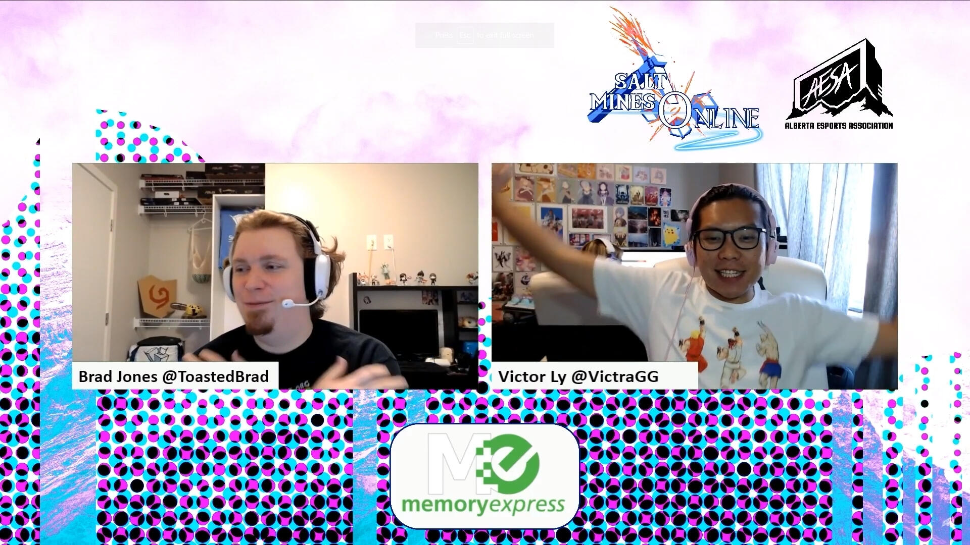
salt mines 2020
calgary's top esports event: online

Taking Calgary’s premiere esports event online - the Salt Flats experience continues online. Salt Mines brand was created in defining the “transformative” space that has become online local events. Broadcast and stream assets developed to be used for livestreaming the tournament over the weekend. Provided continued expertise and advisory throughout the event: coordination, equipment and online troubleshooting.Panels were coordinated to fit a timely schedule: 3D printing, Rivals of Aether character creation, retro game speedruns and - as tradition - an event wide rock, paper, scissors tournament along with a myriad of other games or panels. Event stream was edited, produced and archived to Alberta Esports Association social media platforms with accompanying content ie. thumbnails.watch here
Women Leadership in the Industry - Salt Mines Onlinewatch the event trailer here
Salt Mines 2020 Trailer
acac collegiate smash 2020
paving the way for canadian collegiate esports
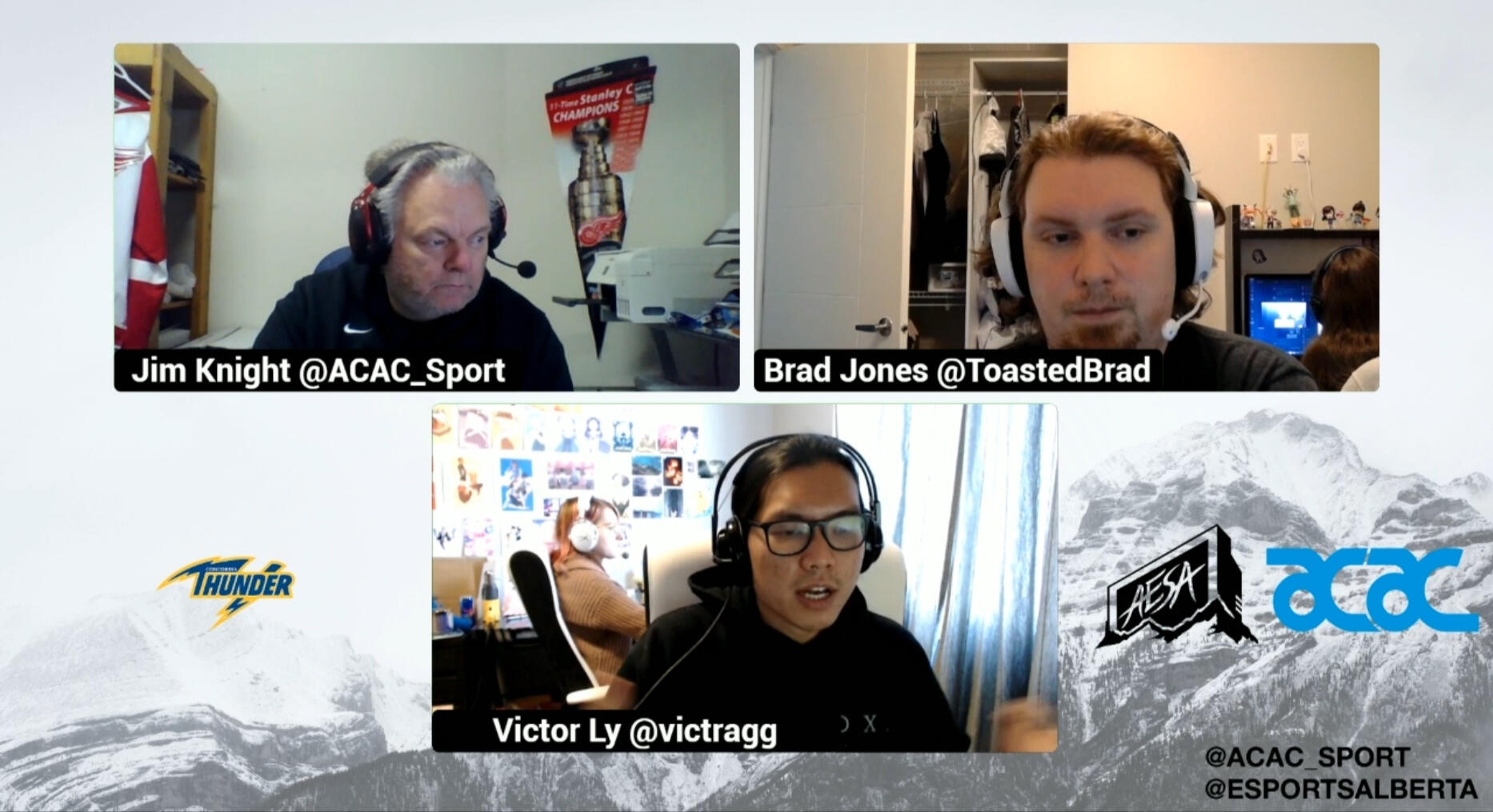
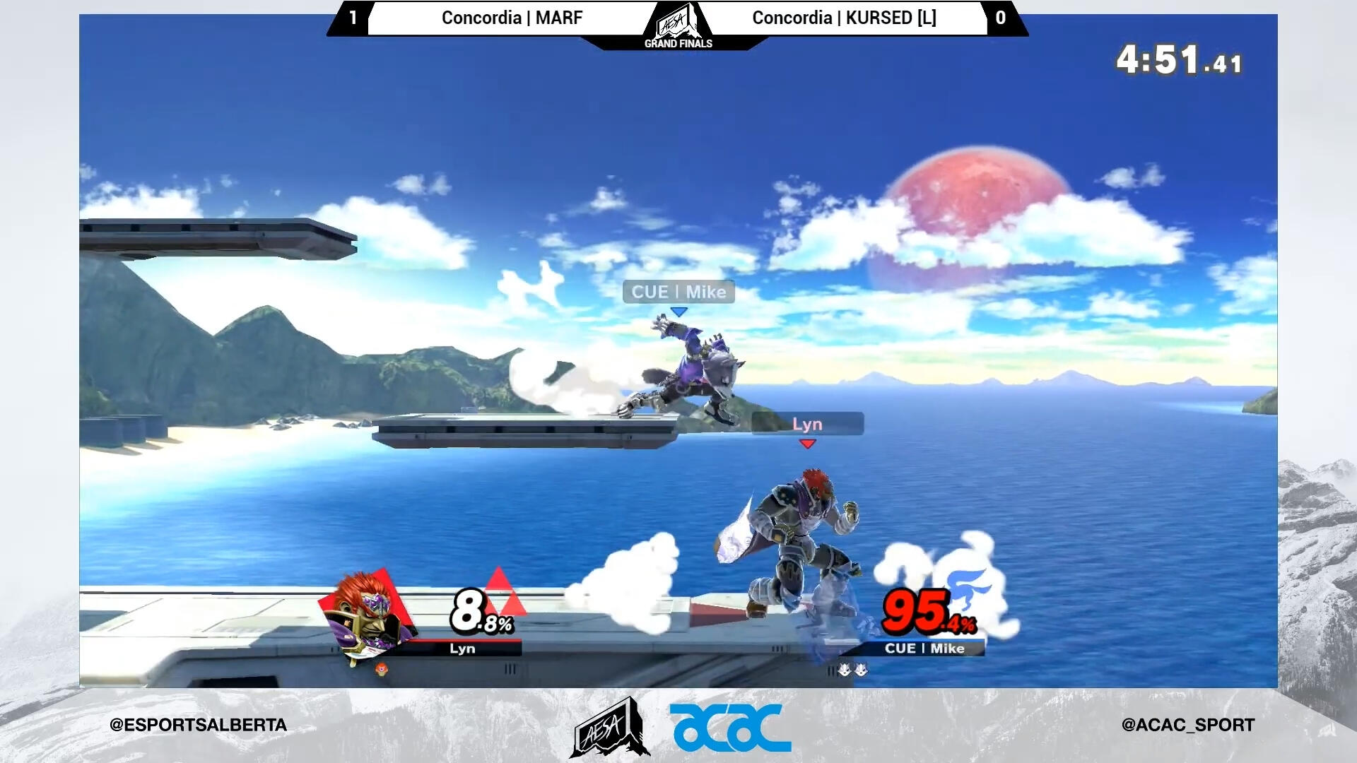
Overlays and assets developed for the new Alberta Collegiate Athletic Conference and Alberta Esports Association partnership. This partnership set the stage for esports in Alberta post-secondary institutions - specifically online due to COVID-19. The kick-off would consist of a Super Smash Bros event where students per college would signup, confirm their placement and compete in an online bracket. Assets were repurposed for AESA wide events to be used for varying online content. Event was edited, produced and archived to Alberta Esports Association social media platforms.watch here
ACAC 2020 SSBU Grand Finalsofficial acac post
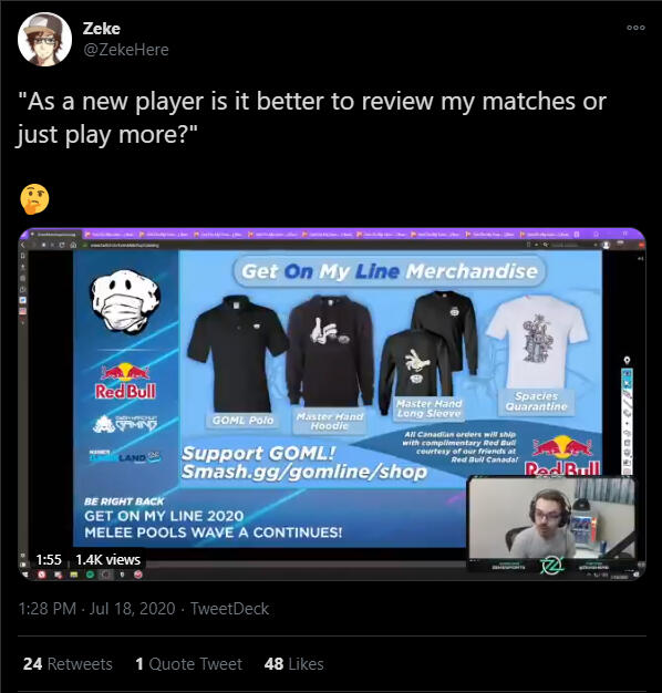
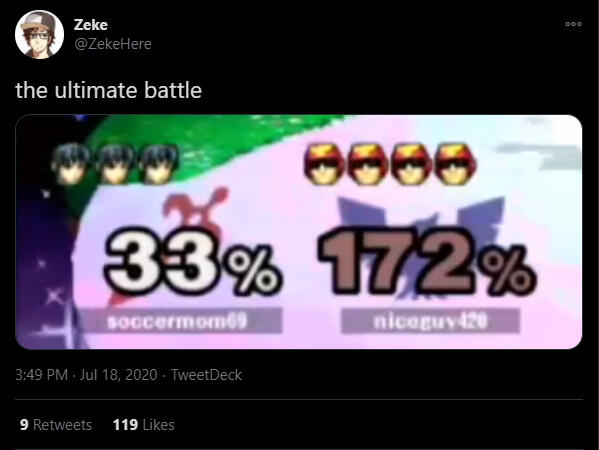
@zekehere for redbull goml 2020
content curation for smashs' finest

Social media management and content curation for @ZekeHere, a professional Super Smash Bros coach, on behalf of Red Bull Canada during Get On My Line 2020 - a Super Smash Bros tournament taken online, more commonly known as Get On My Level. Clipped, produced and posted varying clips of ZekeHere’s expertise reviewing event replays and notable moments to Twitter. Other content was also posted in an effort to achieve virality in specific occurrences aimed at the intended audience. The event spanned over the weekend of July 17th, 2020.click here for more - twitter

youthlink digital communications
paving the way for canadian collegiate esports

Developed a complete social media strategy and calendar for the year of 2018. YouthLink is a non-profit organization that seeks to create understanding and community between Calgary Police Service and the general public. The facility functions as a Police Museum and archive in educating patrons on the history of the Calgary Police Service. Content ranged from event graphics, museum highlights, informational or educational graphics and video content.

park show 2017
a timeless fashion experience

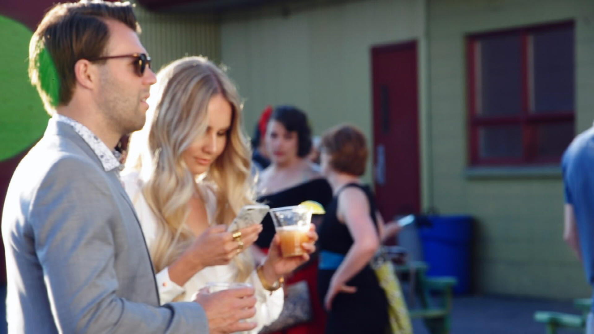
A production of PARKshow 2017, highlighting the experience of the show in montage form. Production focused on a myriad of elements: showgoers socializing, models walking the runway and vendors showcasing their products.Various shots, post-production techniques and aesthetic choices were made in creating an exciting, artistic videographic experience - capturing the essence of creative ability manifested during the show.watch here https://youtu.be/yEwVFnua4IM
salt mines online
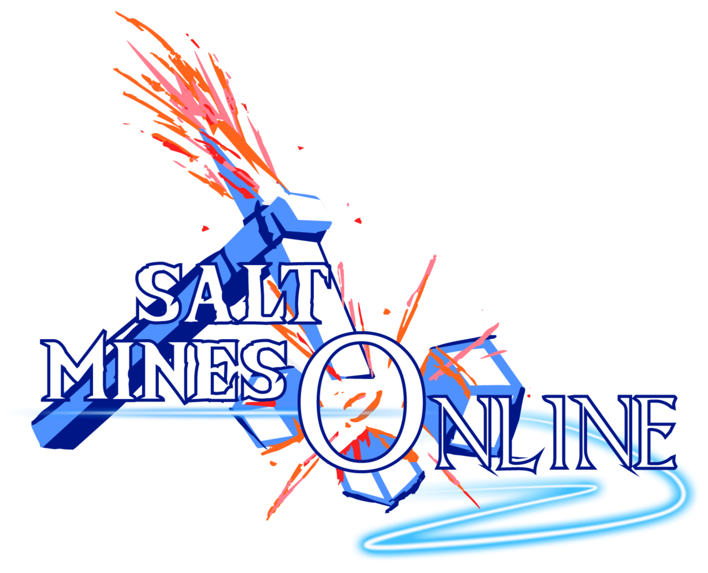
Salt Mines Online was designed as a transformative piece from the Salt Flats 2020 logo - a three-piece “salt” granule. Client request was to make it “as if it was ‘breaking’ using the pickaxe imagery of past events” with a larger “emphasis on the O of online - as if it were a classic MMORPG with generic ‘online game’ elements”.Fulfilment of these specific guidelines was produced to create the Salt Mines 2020 logo: an energetic logo loaded with features seen in early 2000s gaming branding with a modern look. Color used was the blue of the past Salt Flats event contrasted by the orange and red “sparking” of the pickaxe.watch the event trailer here Salt Mines Online Trailer
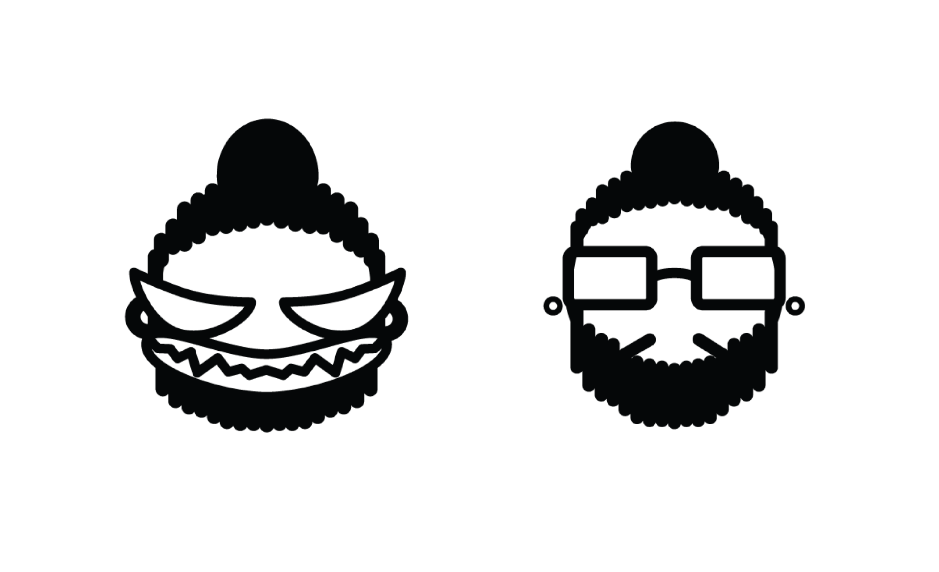
personal branding
Two logos developed as a representation of self in the professional space. Andrew Simon - the design professional invested in forming data into information. Gobrinz - a long time gaming content creator deeply invested in the gaming and esports space. Each logo is intended for a specific audience dependent on interaction and intent of discussion. Here, there exists a split of persona - designer by day, gaming creator by night. The tonality differs depending on the discussion and sometimes where the line blurs.The personal logo of Andrew Simon is intended to communicate a design mantra which encapsulates the designers aesthetic preferences: minimalistic, monochromatics, principle, the enablement of contemporary thinking. The logo of Gobrinz communicates a charismatic and energetic esports and gaming persona. Both being memorable representations of the person who would define himself with such iconography.
hemp roots cafe
Rethinking the original Hemp Roots logo into a new brand - a coffee shop headshop hybrid. The Hemp Roots Cafe brand is a reiteration of the original Hemp Roots brand with few variances to build upon the equity of the brand as per request. The intent was to marry the Hemp Roots look with a “good ol’ coffee” aesthetic - since nothing can beat the timeless classic that is coffee.
the hitbox
A rebrand for a popular gaming podcast presented by Rogers, The Hitbox brings the best in the North American esports scene to discuss their journey and interests. Logo development considered the concept of a “hitbox” in gaming: fighting games, fps, and more. The basis of the hitbox shape is developed from Ryu’s hitbox in Street Fighter Alpha 3. A more grotesk, bold font is used to enable a canvas within the logo in which contrasting color may thrive. The 3D element of the type and logo enables a dynamic space for the logo to exist within and upon. Background and styling elements further consist of pixelated gaming iconography across vibrant backgrounds to compliment the equally unique logo.

Anthos
Branding concept for an infused candy product. Developed concept featured a leaf of sorts with a prairie rose as requested in varying styles. Identity of the brand was to reflect the Canadian roots of said candy brand.

hemp roots
A brand revitalization project. Hemp Roots’ brand was feeling old, or dated, at the time and requested that the logo be made “like new” but still retained the same identity. Through some preliminary research and understanding, the logo was developed into something more modern; more “of this decade”.visit https://hemproots.ca/

herbist
A new tea brand focusing on organic, unique, fairly sourced tea. To be a herbist is to be one “skilled in herbs; a herbalist” as the brand highlights a level of expertise and mastery in understanding the herbal attributes and compositions of teas.

limit break
A branding project for Limit Break TV, a premier stream team featuring Final Fantasy content on the gaming platform Twitch.tv. Multiple iterations of the logo were developed with specific requirements: sword imagery, necessary text, Final Fantasy themed visuals, some form of explosion. The necessary research required in developing this brand was to fully engage and understand the Final Fantasy franchise to grasp the culture surrounding it; to manifest everything that is Final Fantasy into a brand logo.

pwrshark
A developed brand for streamer, DJ and gaming enthusiast Power Shark - abbreviated down to PWRSHARK. Upon producing iterations, client expressed an intense liking to that of a certain Sharks sports team. The objective: create something unique to the client that is alike to the San Jose Sharks without recreating literally the branding for The Sharks. Illustration of a gold gradient shark was produced as a complete product. Final product included social media assets, branding package and varying sizes and file types to be used during live broadcast.
azura's stars
Branding concept developed as an Elder Scrolls Esports team in reference to the ingame god by the same name - Azura. Use of the Azura’s Star logo, the crescent moon and star, were iterated upon with varying elements.

viable
Magazine branding concept developed as a representation of magazine content. Viable regards the United Nations Sustainable Development Goals - suggesting a “viability” in worldly coexistence. Viable utilizes a cursive typeface to weave a heart shaped recycle sign into the logo as a highlighting of sustainability.
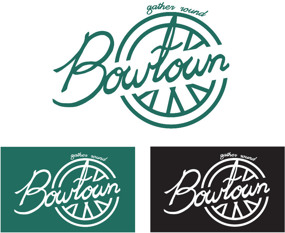
bowtown
A rebrand of a notable residential area within Calgary, AB, Canada. Bowness is a thriving town culture within North West Calgary: dotted with diners and local business down its town main street. A heavy bike culture influenced the once-town that was eventually absorbed by Calgary. Through ethnographic research and understanding the culture of the area, Bowtown was created: a brand reflecting the 50s and 60s bike and diner culture that the Bowness community prides itself on both in the past and today.
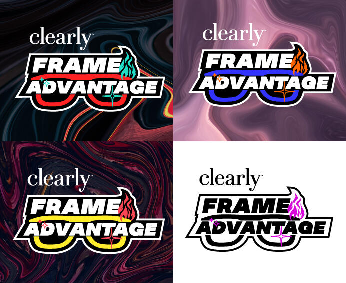
clearly frame advantage
Tournament branding created on behalf of TGS Esports in collaboration with Clearly: the eyewear brand. Frame Advantage pinpoints the synergy between gaming and glasses: to have more frames within video games equates better gameplay, or advantage, and to any wearer Clearly glasses frames provide an advantage. Iconography of glasses is heavily highlighted with complimentary coloring that accents the top right of the logo – a flame and a spark to imply an advantageous, hype and exciting accessory that any esports competitor could utilize.Final product included tournament branding, social media assets and addons, broadcast assets to be used during live broadcast, brand guidelines and more.see more
Clearly: Frame Advantage
durex: game on gauntlet
Transforming the definitive Durex brand into a tournament identity on behalf of, and in collaboration with, TGS Esports. Durex’s messaging wanted to be one of inclusivity, playfulness and exploration: sex is an adventure for everyone, respectfully. Durex: Game on Gauntlet was developed as the competitive tournament name. A title fitting of the accompanying roleplay iconography: the bow, the flame and the sword. Each icon would describe a class within gaming, more specifically in roleplaying games, as parties or groups are formed usually of unique identities, jobs, roles or classes within a game. The concept of the icons together implies adventure, playfulness, and exploration for all that would have it – possibly a group that would endure a gauntlet of experiences together.Final product included tournament branding, social media assets and addons, broadcast assets to be used during live broadcast, brand guidelines and more.see more
Durex: Game On Gauntlet
bc esports association
Branding and identity developed for the British Columbia Esports Association. Core imagery requested involved the elements popular to BC’s general surroundings and colors: mountains, the ocean, and trees while communicating the exact concept of BCEA as one might other official sports associations. Final iconography used was the mountains laid overtop selected typography, with a controller resting upon the outline to better communicate the BCEA as a gaming related organization. The controller lightly integrates the colors of those that would represent BC as a province within the buttons.Final product delivered features a complete branding package.
deke the halls
Creating an online counterpart experience to that of the IIHF World Juniors in collaboration, and partnership, with TGS Esports. Developed to encapsulate holiday hockey, Deke the Halls derives from a favorite festive tune. A red circle emulates the holiday feeling, adorned by rope lights and placed within a familiar circle one might encounter in the rink. Selected typography represents hockey tradition and a call back to a classic experience, further complimented by hockey stick iconography.Final product included tournament branding, social media assets, broadcast assets to be used during live broadcast and general brand guidelines.see more
Deke The Halls
tgs outpost
A pop-up brand developed for TGS Esports. TGS Outpost first appeared at Vancouver FanExpo 2022, where it was nested in the middle of the convention centre hall. This prompted the conceptualization of “The Outpost” featuring games and esports. The branding further highlights these features: specific controller types atop a fortress like illustration – TGS Oupost. TGS Esports now activates using this branding when it activates as a third party experience provider.Final deliverables feature adapted TGS broadcast assets, general media and social media assets, printables and digital signage.see more
TGS Outpost: FanExpo 2022
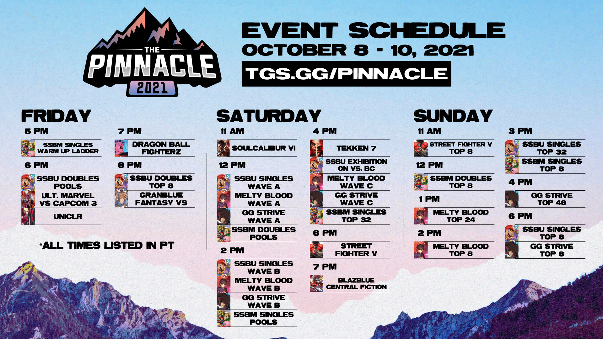
pinnacle 2022
vancouver's fighting game major
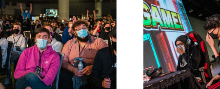
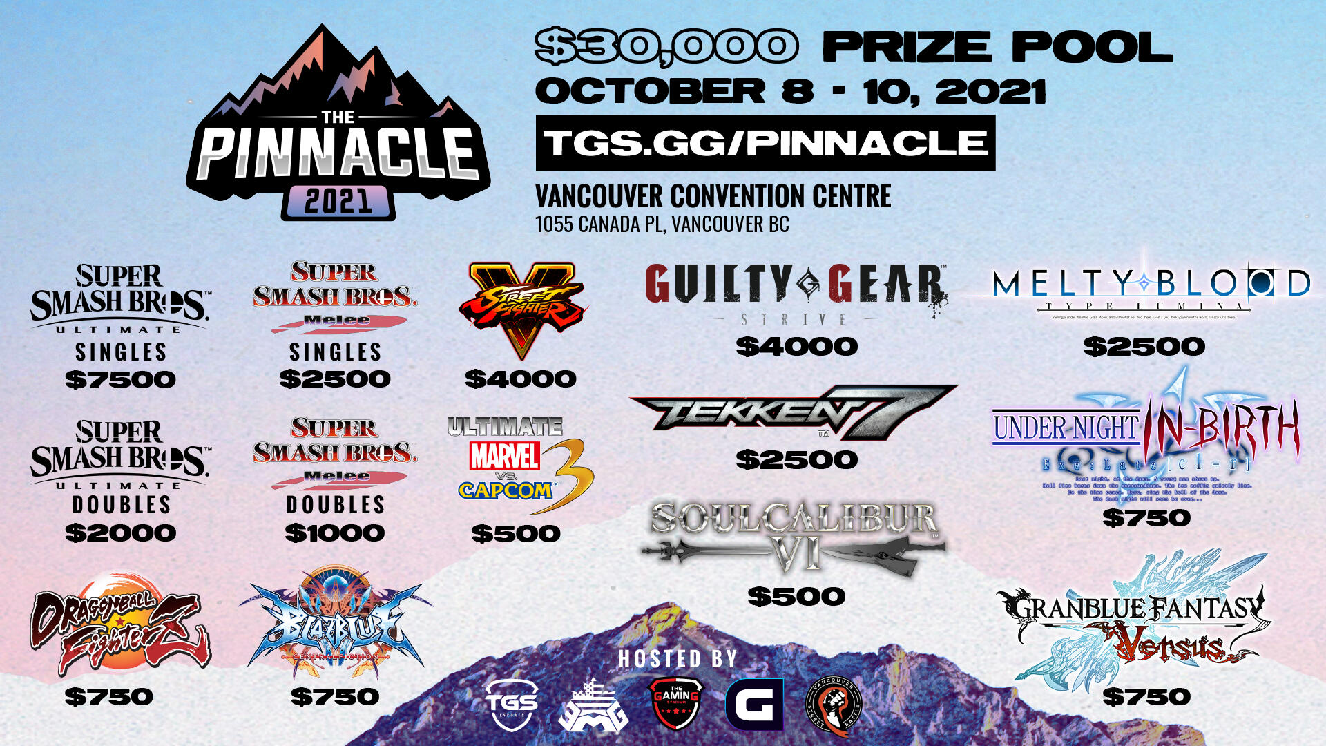
The return of Vancouver’s fighting game major: Pinnacle 2022 by TGS Esports. Existing identity highlights the emphasis of notable BC mountains and mountain ranges utilizing the pink-purple gradient. A textured, photo-worn, mountainous look coupled with a bolded, grotesque font crafts a “ski resort” aesthetic defining the return to in-person LAN tournaments in the PNW, further integrated and complimented by minimal designed visuals. Graphics made were utilized in tournament promotion, announced games with prize pool, signage and varying static and dynamic broadcast assets.Final deliverables included tournament graphics, social media promotional content, signage and posters, winners or top 8 visuals, broadcast assets including animated visuals and completed showbuild as a VMix stream asset.watch here
Pinnacle 2021 SSBU Grand FinalsPinnacle 2021 Guilty Gear Strive Grand FinalsPinnacle 2021 Street Fighter V Grand Finals
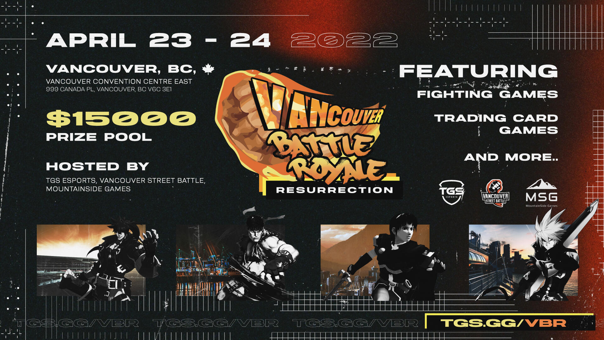
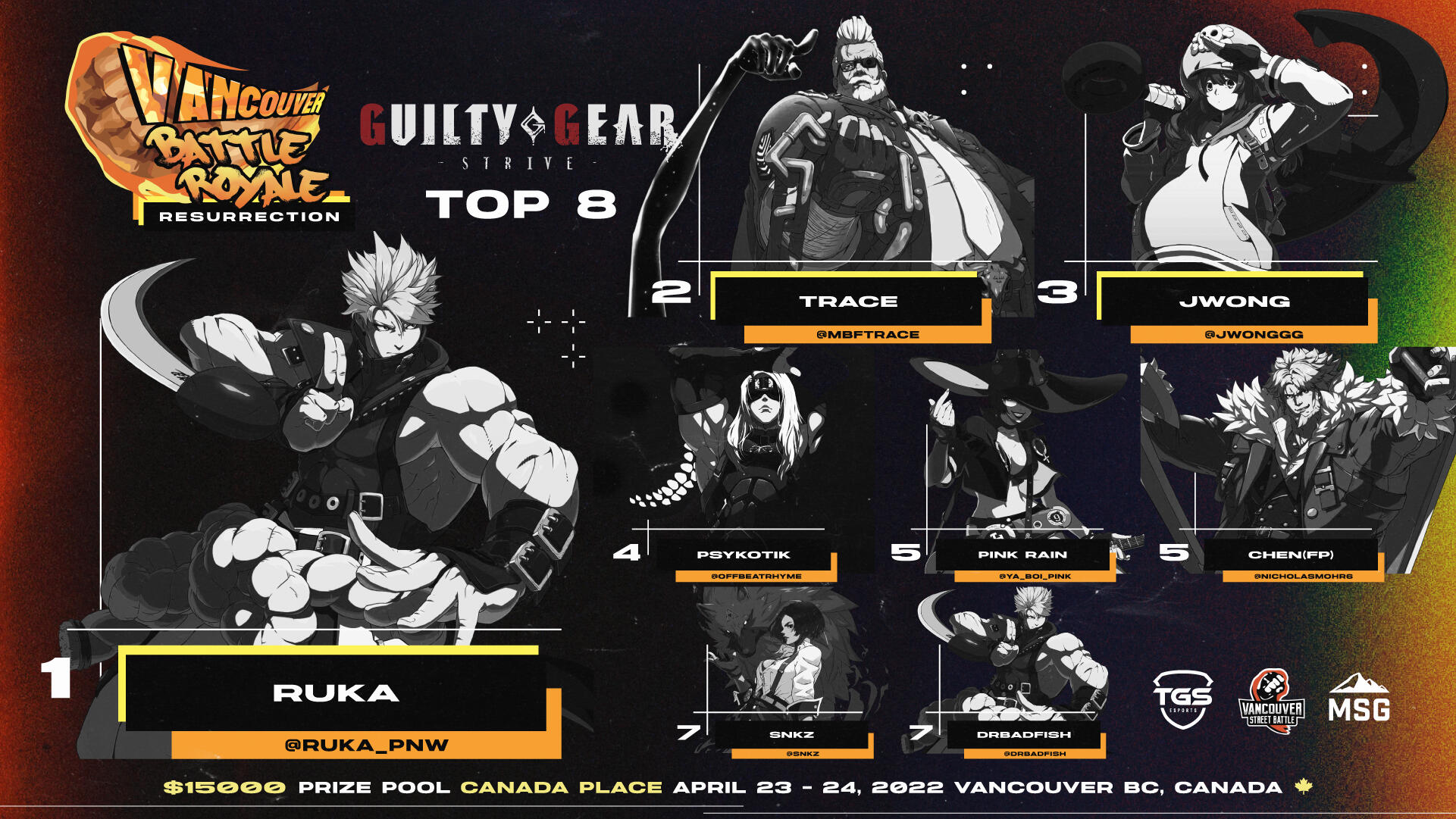
vancouver battle royale: resurrection 2022
a vancouver fighting game regional returns
A fighting game favorite gets resurrected in 2022. Brought to you by Vancouver Street Battle and hosted by TGS Esports, the regional Vancouver Battle Royale series returns to BC. Existing identity features the traditional VBR logo: a flaming fist similar to that of the VSB logo notable to the community. The return of this branding would include the subtitle of “resurrection” and be accompanied by visuals of a similar palette of orange and black. A film burn aesthetic complimented by patterning, lines and outlines crafts the visual experience of VBR. Imagery of Vancouver adapted to the palette coupled with overexposed video game character assets announces, and matches, the games and design of VBR Resurrection.Final deliverables included tournament graphics, social media promotional content, signage and posters, winners or top 8 visuals, content addons, broadcast assets including animated visuals and completed showbuild as a VMix stream asset.watch here
VBR 2022 Guilty Gear Strive Grand FinalsVBR 2022 King of Fighters XV Grand FinalsVBR 2022 SSBM Grand Finals
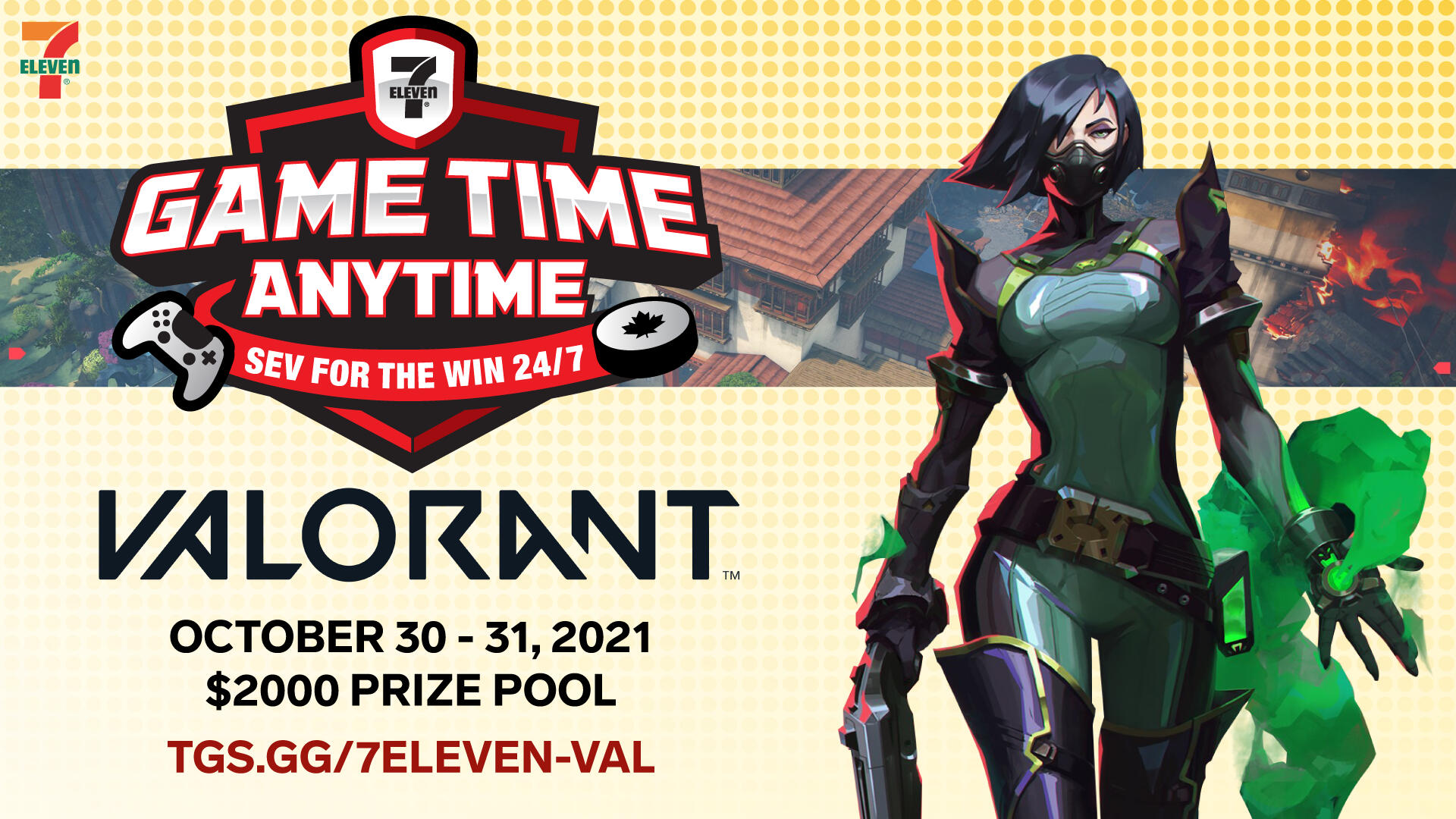
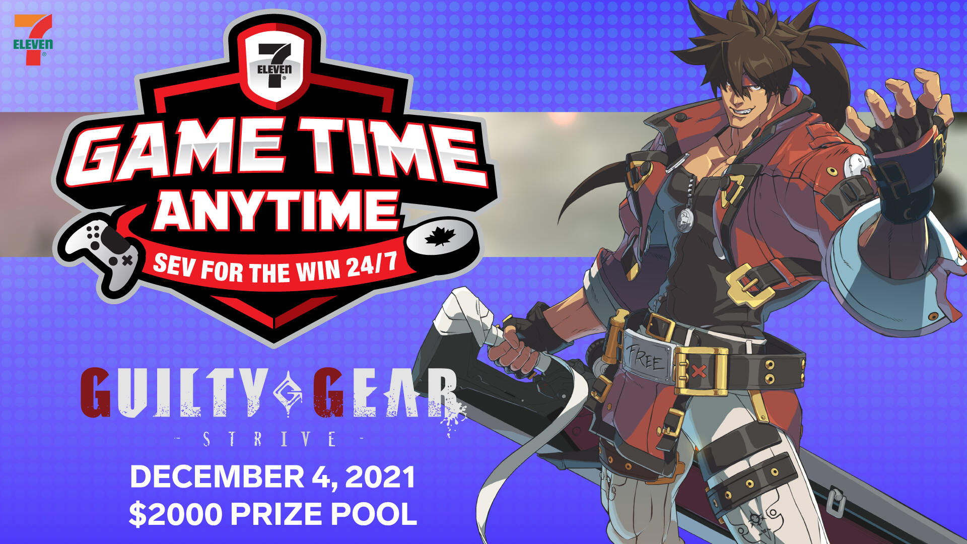
7-Eleven Game Time Anytime
a tournament promoting 7now: game time anytime
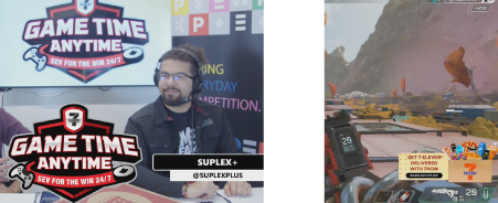
A series of esports tournaments developed in partnership with 7-Eleven hosted by, and in collaboration with, TGS Esports featuring Valorant, Apex Legends and Guilty Gear Strive. 7-Eleven sought to promote Game Time Anytime with 7Now, the 7-Eleven food delivery service, to an esports and gaming audience. Visuals developed based on the general aesthetic of 7-Eleven’s 2021 graphics and design. By study and deconstruction of 7-Eleven’s 2021 ethos could the aesthetic be reformed and deployed as an esports and gaming friendly brand that encapsulates Game Time Anytime by 7-Eleven. Broadcast assets developed across three games with a natural forming integration of the 7Now promotion of Game Time Anytime.Final deliverables included tournament graphics, social media promotional content, content addons, broadcast assets including animated visuals and completed showbuild as a VMix stream asset.watch here
7-Eleven Game Time Anytime feat. Valorant7-Eleven Game Time Anytime feat. Guilty Gear Strive
7-Eleven Rocket League
integrating 7-eleven into rocket league culture
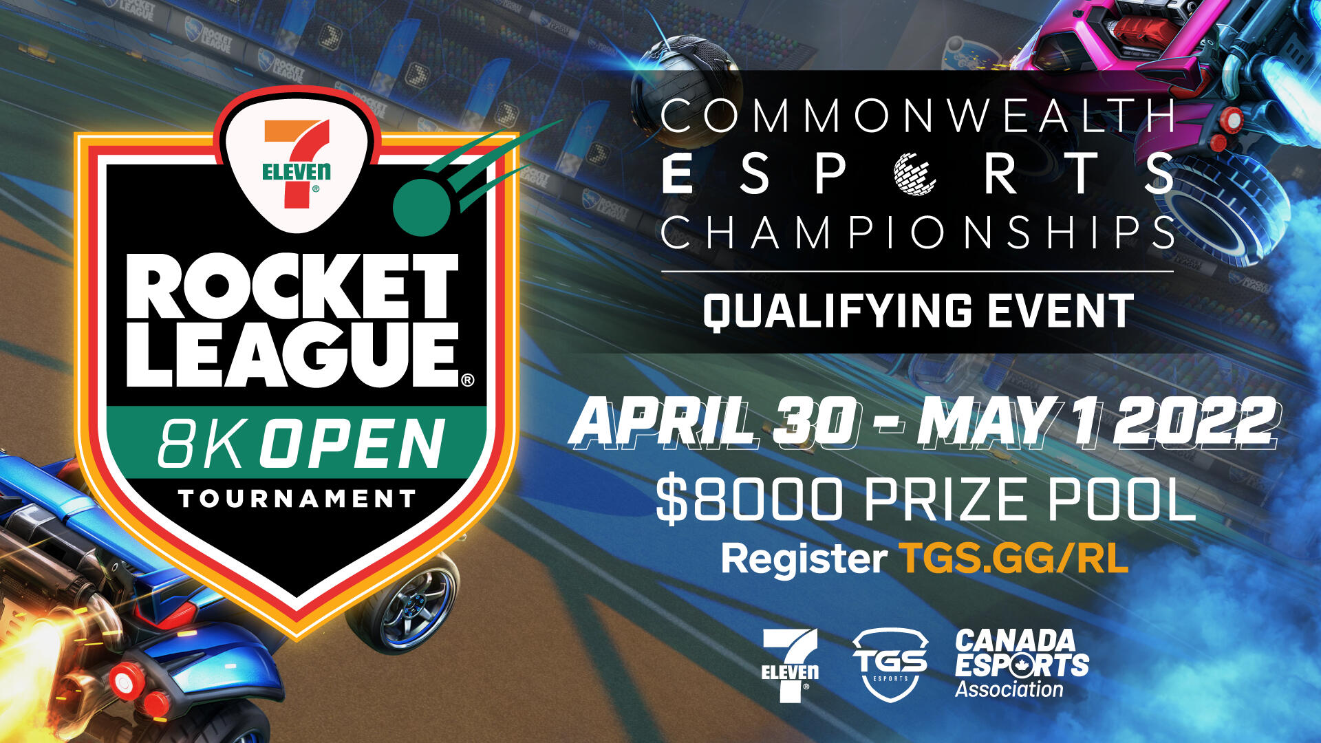
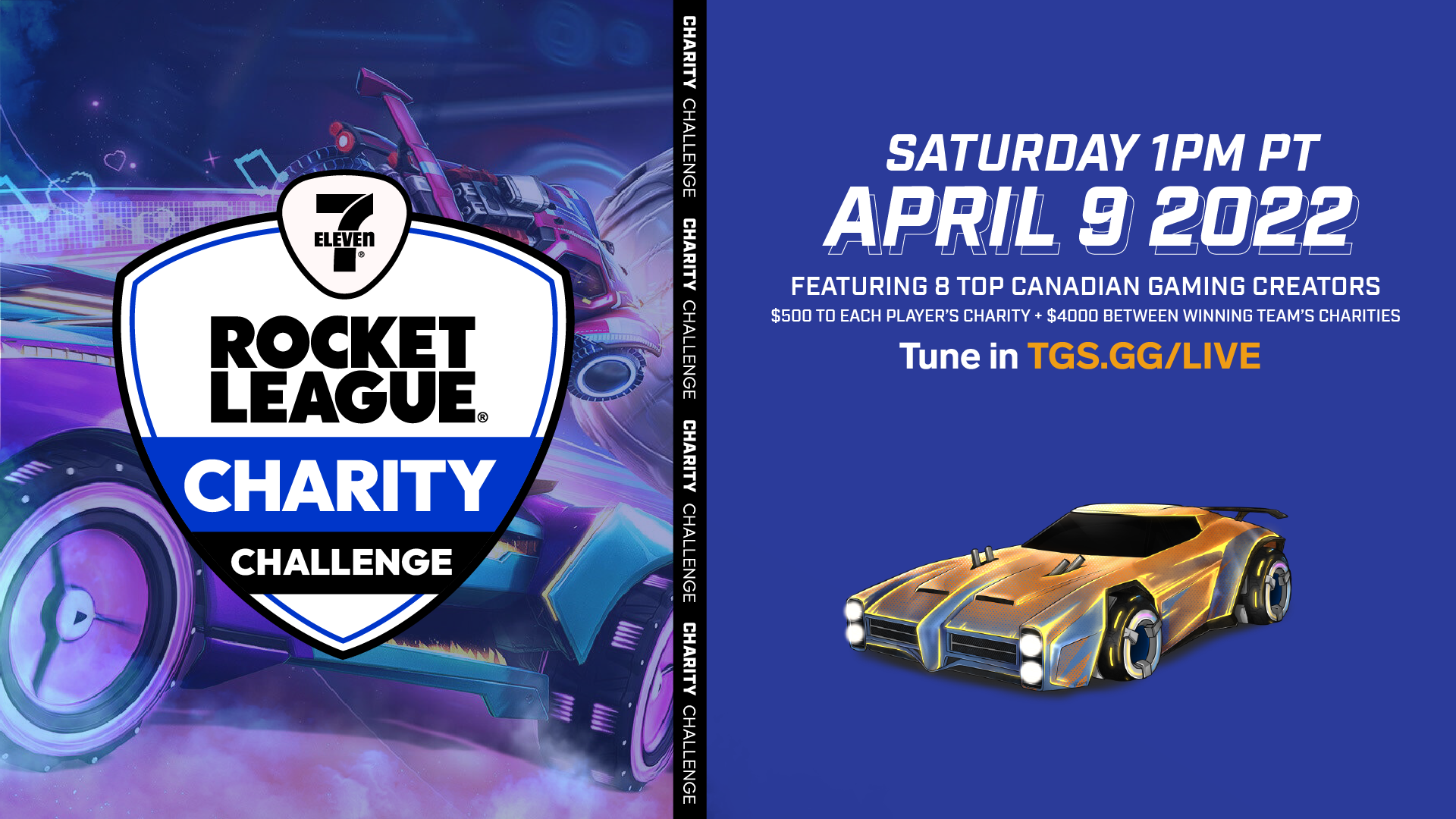
Psyonix partners with 7-Eleven to produce the 7-Eleven Rocket League Tournament Series spanning across four different events: Collegiate Challenge, Gamer’s Lounge, Charity Challenge and a final 8K Open. In partnership and collaboration with TGS Esports, each tournament series visual was constructed of 7-Eleven visuals, primarily centered around the showcasing of in game promotional items produced in partnership.Varying sub-brands were developed to promote specific events and their variable parts: Collegiate Championships would require the highlighting of specific institutions and teams, Gamer’s Lounge would require promoted information for an in-person event, 8K Open would be made and produced to attract as many teams in the North American region as possible to compete for a $8000 prize pool.Final deliverables included logo sub-brand designs, tournament graphics, social media promotional content, influencer deliverables and stream overlays, content addons, broadcast assets including animated visuals and completed showbuild as a VMix stream asset.watch here
7-Eleven Rocket League Canadian Collegiate Championship7-Eleven Rocket League Charity Challenge7-Eleven Rocket League 8K Open Tournament
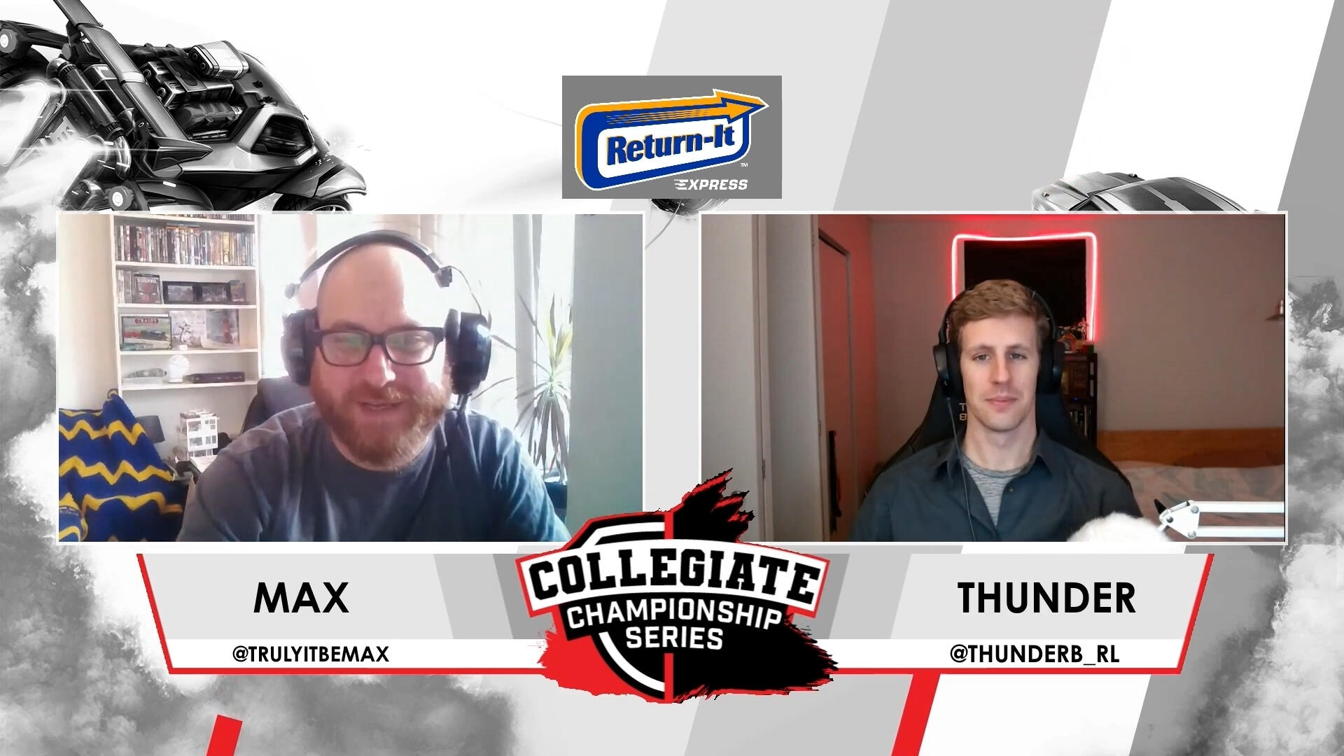
collegiate championship series 2021
designing the canadian collegiate esports adventure
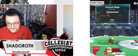
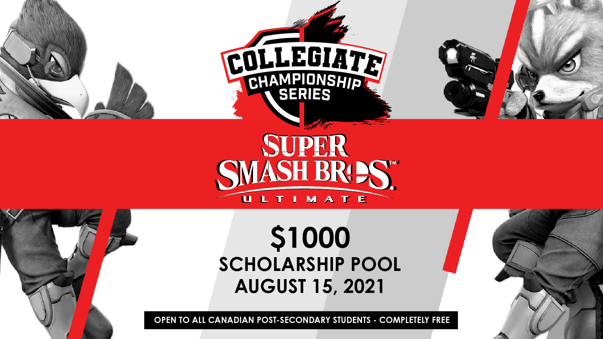
The Collegiate Championship Series was developed by Volcanic, now part of TGS Esports as a collegiate esports initiative. This initiative consisted of a series of seasonal esports tournaments where mostly Western Canadian schools competed and participated to win school scholarships and advances to develop esports programs. The developed branding for the Champs series combined the TGS Esports shield iconography with the Volcanic logo which appears more “explosive”. A traditional sports typography spreads across the combined icons to create a logo indicative of post secondary sports. Tournament visuals revolved around the palette of red, white and black featuring game character assets in greyscale among shapes and emboldened red lines. A clean, minimal aesthetic fit for higher education esports dotted with engaging visuals.Final deliverables included logo, tournament graphics, social media promotional content, broadcast assets including animated visuals and completed showbuild as a VMix stream asset.watch here
Collegiate Championships Series - Rocket League Winter Finals
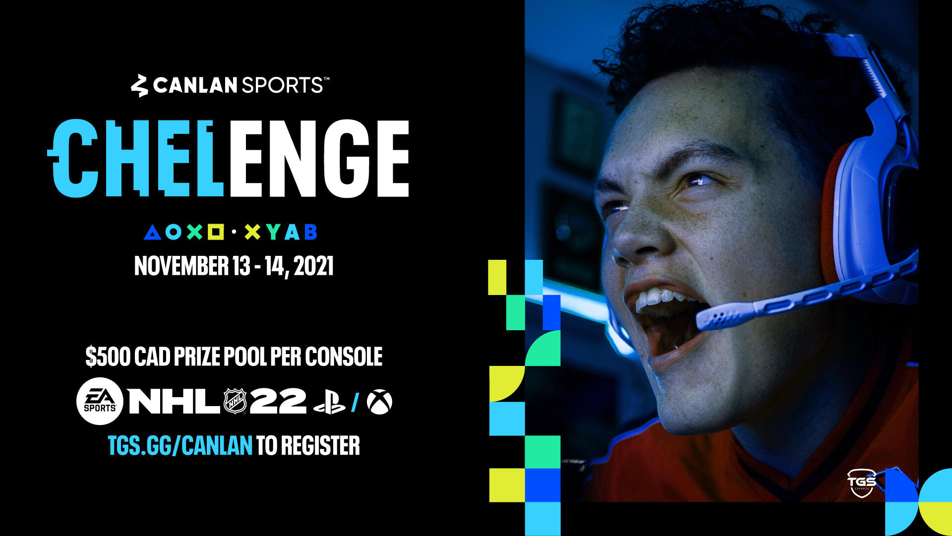
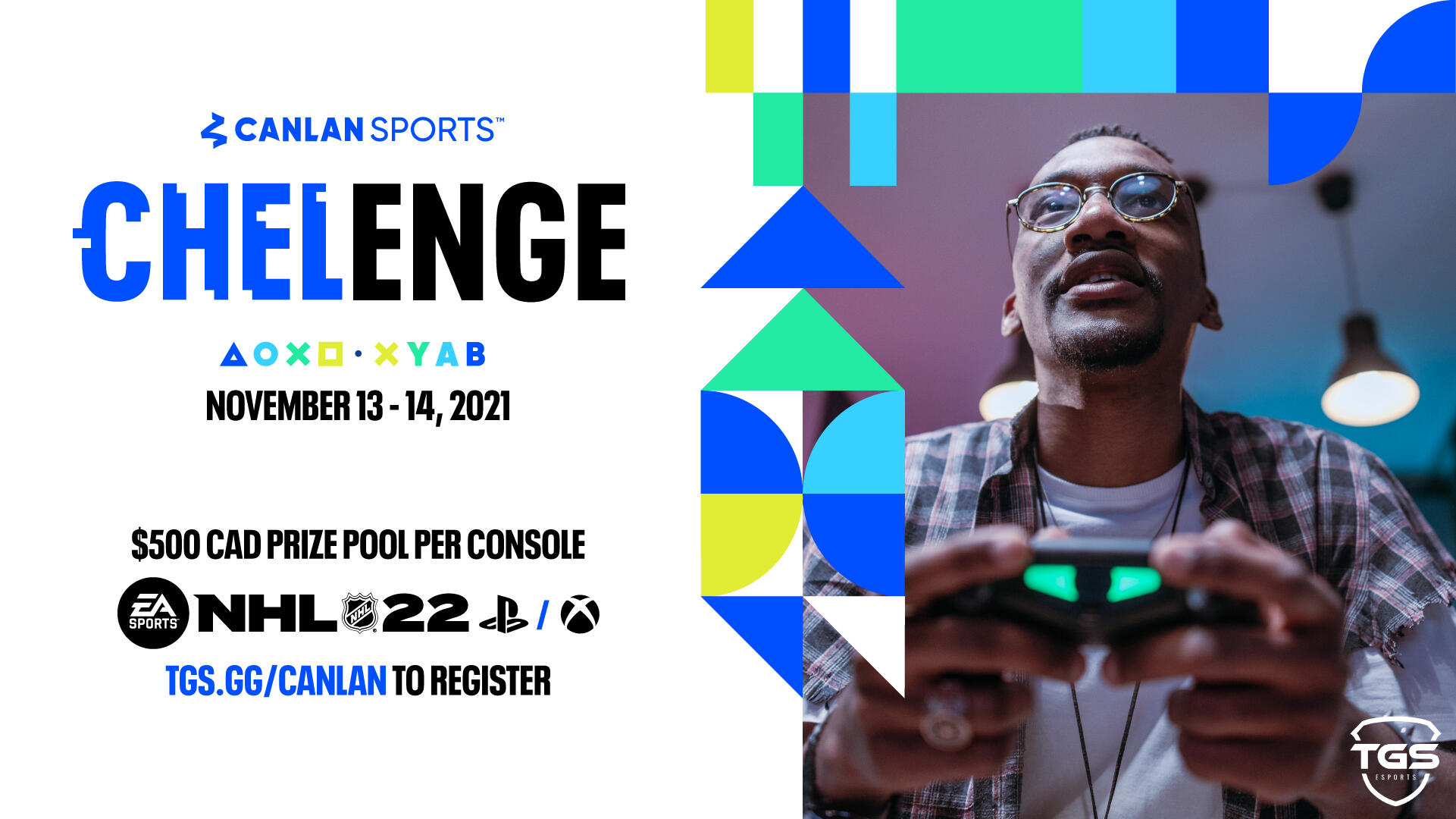
canlan chelenge
canlan sports: nhl enters online esports
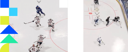
Canlan Sports dives into esports with Chelenge: an NHL 22 online esports tournament in collaboration, and partnership, with TGS Esports. Utilizing the ready-made Chelenge identity by Canlan and Canlan brand guidelines, broadcast and social media assets were to be developed. Core features of the Canlan identity were adapted to assets: brightly colored shapes, alternating text colors and use of familiar hierarchies as per guideline usage.Final deliverables included tournament graphics, social media promotional content, content addons, broadcast assets including animated visuals and completed showbuild as a VMix stream asset.
clearly frame advantage
the gaming glasses esports tournament
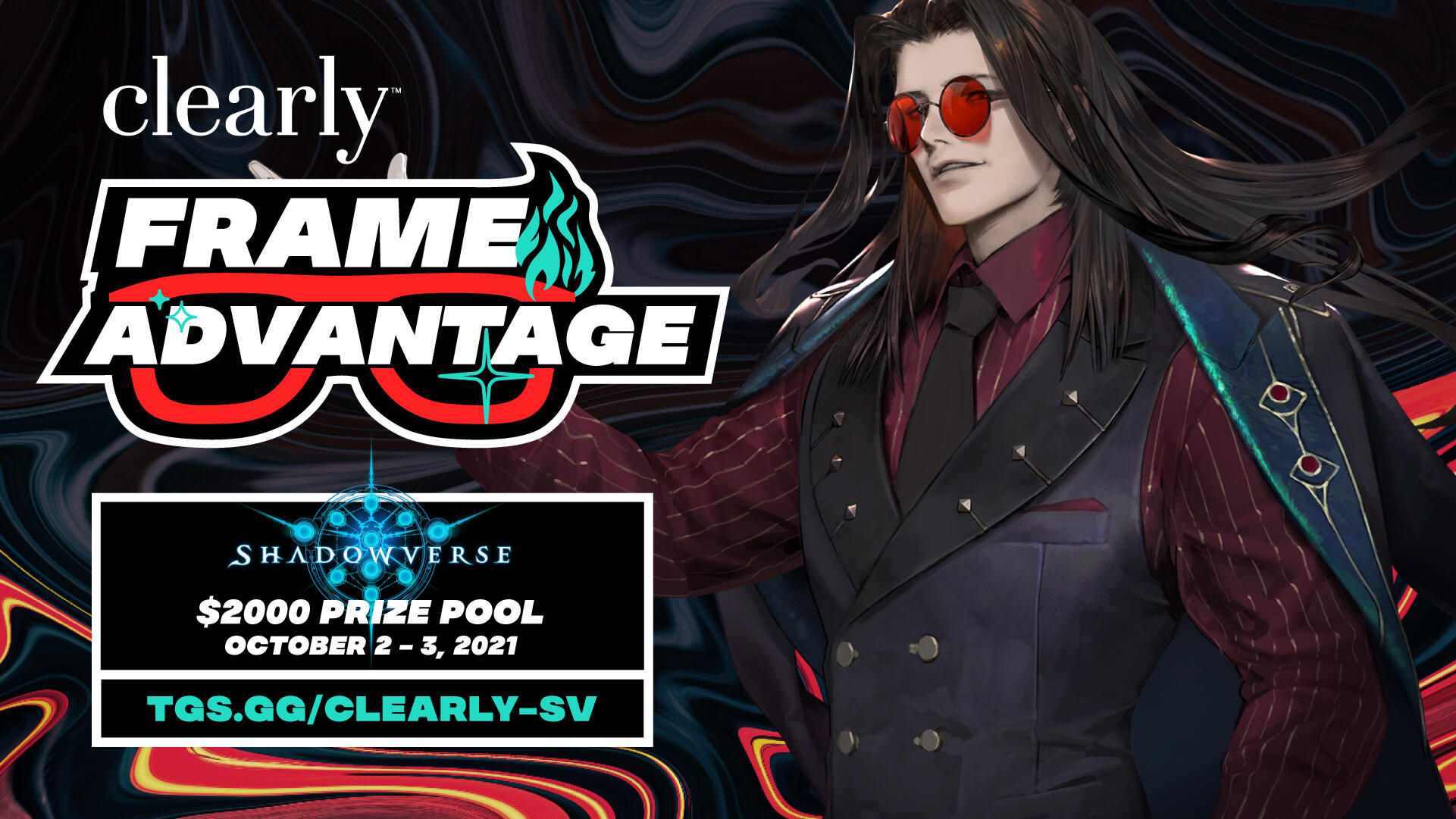
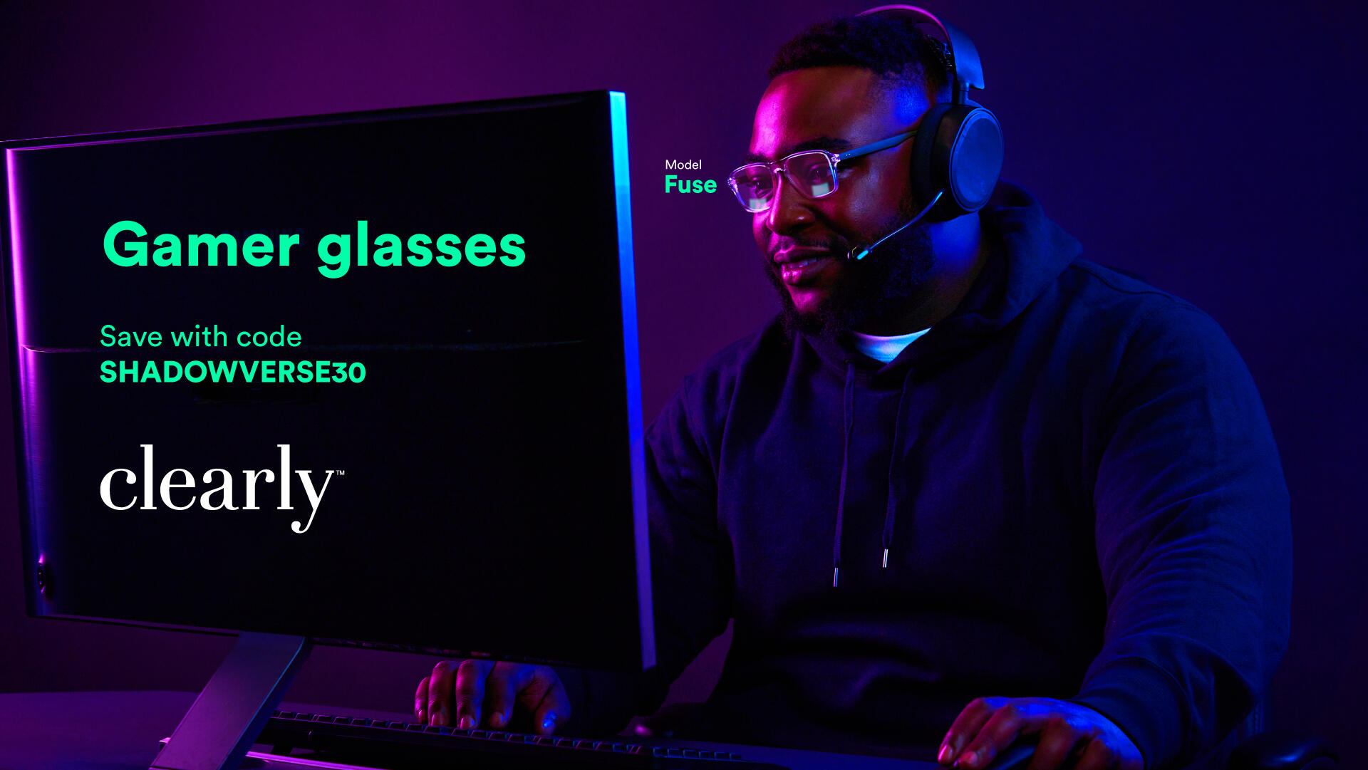
The popular Canadian glasses brand Clearly gets into esports in partnership, and in collaboration with, TGS Esports hosting a series of tournaments. Tournament branding was made in finding the synergies between eyewear and gaming: to have more frames within video games equates better gameplay, or advantage, and to any wearer Clearly glasses frames provide an advantage. Character game assets were exclusively those who wear glasses, or have some relation to eyewear. Integration of glasses visual further creates an integrated broadcast experience, bringing the glasses brand to esports in a unique way. Warped colored palettes shape the background of all assets to further define the visual experience of Clearly.Final deliverables included branding guidelines and identity, tournament graphics, social media promotional content, Clearly gamer designed ads, content addons, broadcast assets including animated visuals and completed showbuild as a VMix stream asset.watch here
Clearly Frame Advantage $2000 ft. ValorantClearly Frame Advantage $2000 ft. MTG Arena
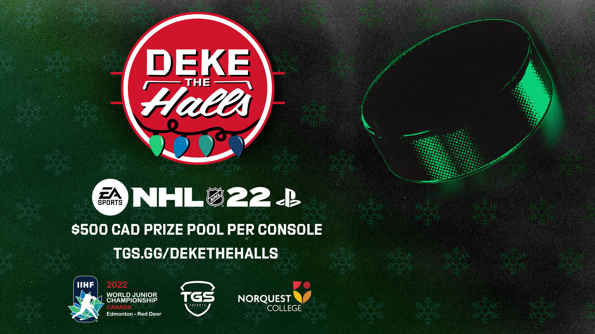
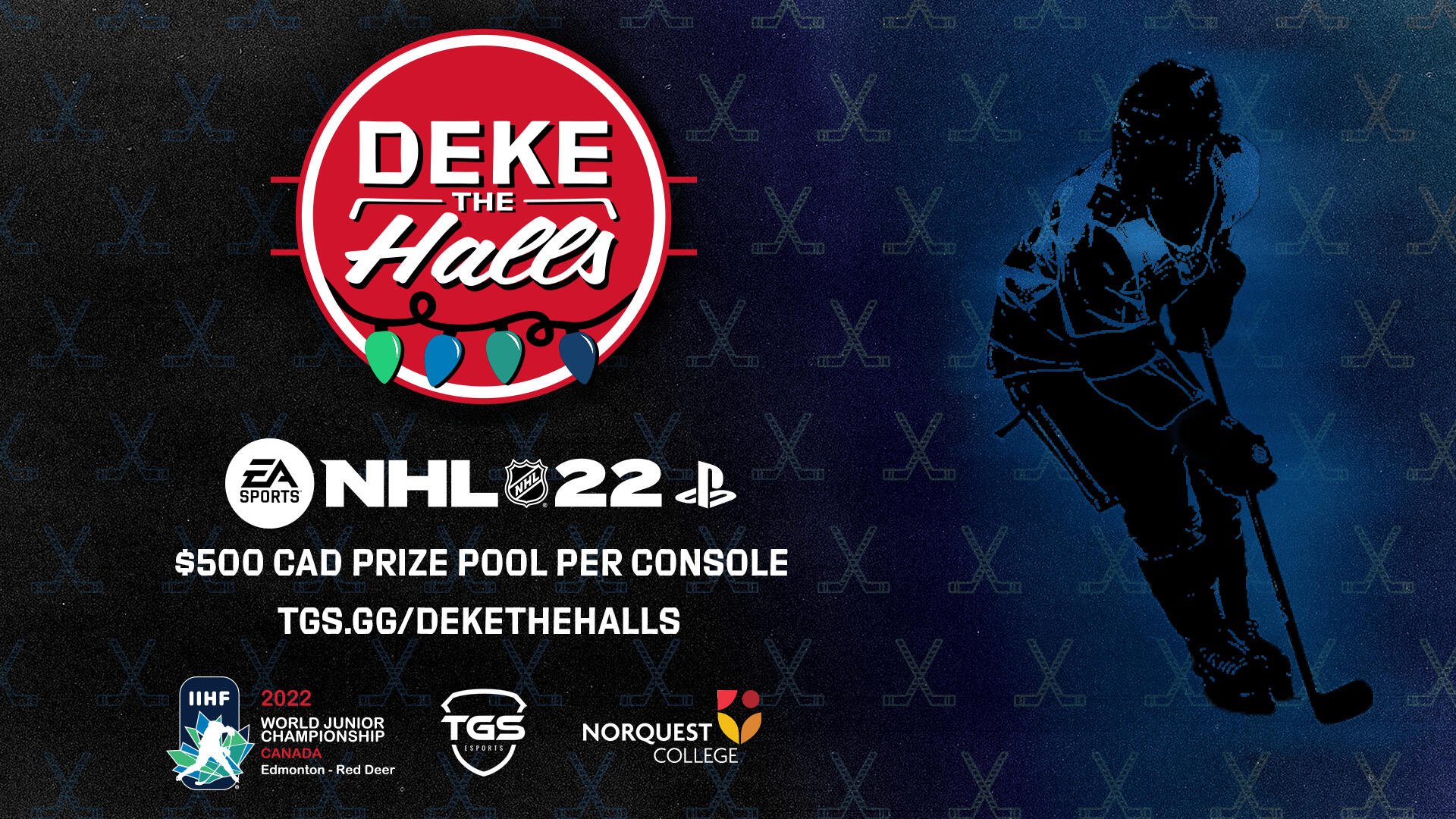
deke the halls: iihf 2022
taking the iihf world junior championship online
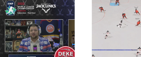
In collaboration with the IIHF for the World Junior Championship of Canada, TGS Esports hosted Deke the Halls: an online NHL tournament to mirror that of the real life tournament. Participating teams were also restricted to play teams exclusive to the World Junior as an added caveat to create a more robust experience surrounding the event. Branding developed to encapsulate holiday hockey, Deke the Halls derives from a favorite festive tune. A red circle emulates the holiday feeling, adorned by rope lights and placed within a familiar circle one might encounter in the rink. Traditional sports typography is used to emulate a classic hockey aesthetic alongside patterned, textured, festive assets for the full holiday hockey experience.Final deliverables included branding guidelines and identity, tournament graphics, social media promotional content, content addons, broadcast assets including animated visuals and completed showbuild as a VMix stream asset.
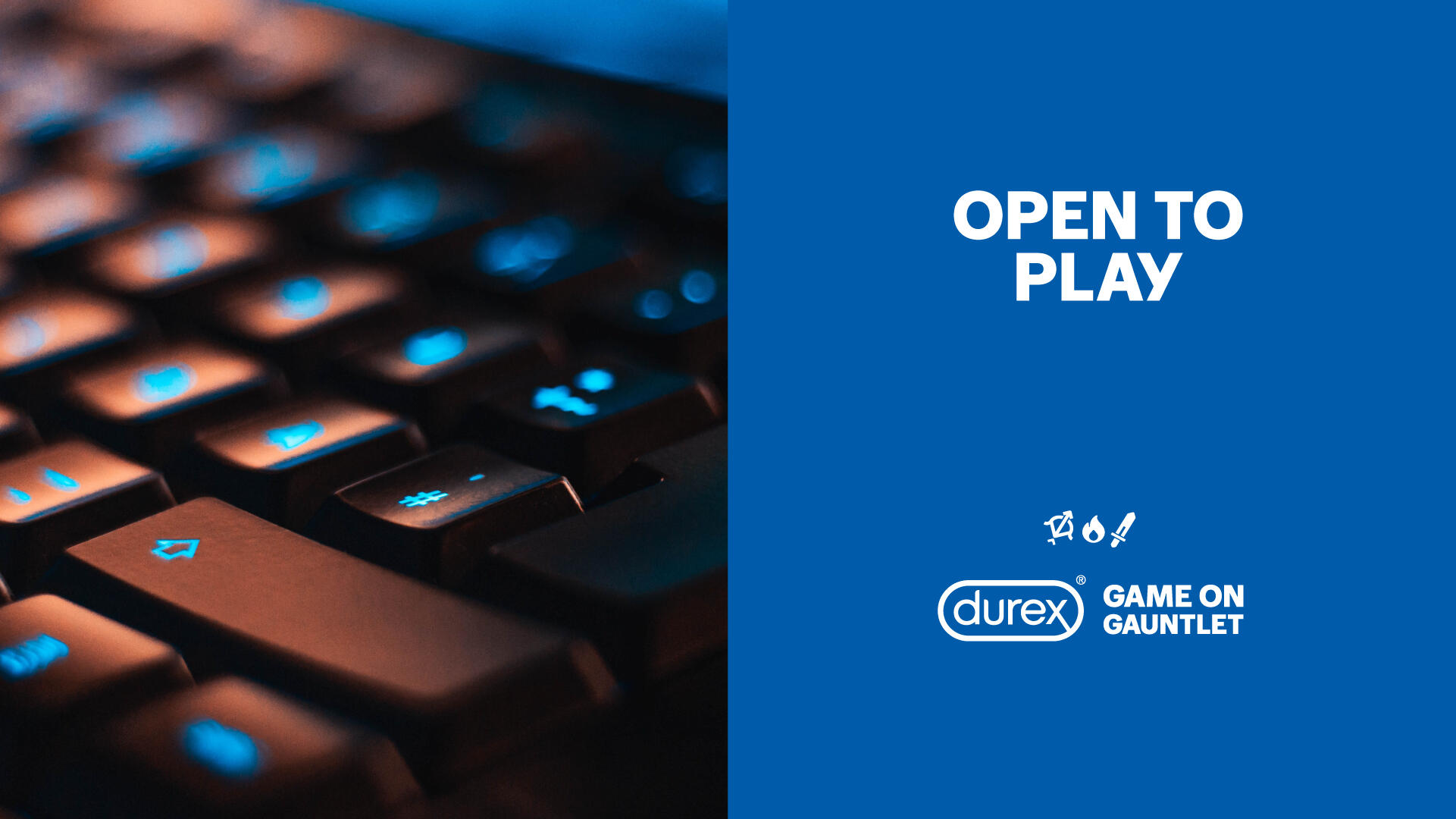

durex: game on gauntlet
crafting the durex brand into esports
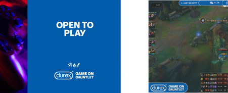
Durex enters the esports space with a series of tournaments in partnership, and collaboration, with TGS Esports. Utilizing existing Durex brand guidelines, Game on Gauntlet comes with the tagline “open to play” as a part of the overall brand message: sex is inclusive, playful, an adventure for everyone, respectfully (even gamer!!). The iconography used alongside Game on Gauntlet is a further representation of this experience with each icon being made to resemble a role within a group or identity within a gaming experience. Creative assets follow Durex’s rigid brand guidelines to fully align with the overarching brand; gaming visuals become a natural part of the Durex brand in execution. Game On Gauntlet makes full, and best, use of the notable Durex blue to further affirm the brand within the gaming space. To achieve a uniqueness within mostly static visuals, animation is brought to the icons to enable livelihood throughout the assets.Final deliverables included branding guidelines, tournament graphics, social media promotional content, content addons, broadcast assets including animated visuals and completed showbuild as a VMix stream asset.watch here
Durex Game On Gauntlet ft. Rocket LeagueDurex Game On Gauntlet ft. Valorant
guide book:
edmonton direct
enabling conversation about albertan made games

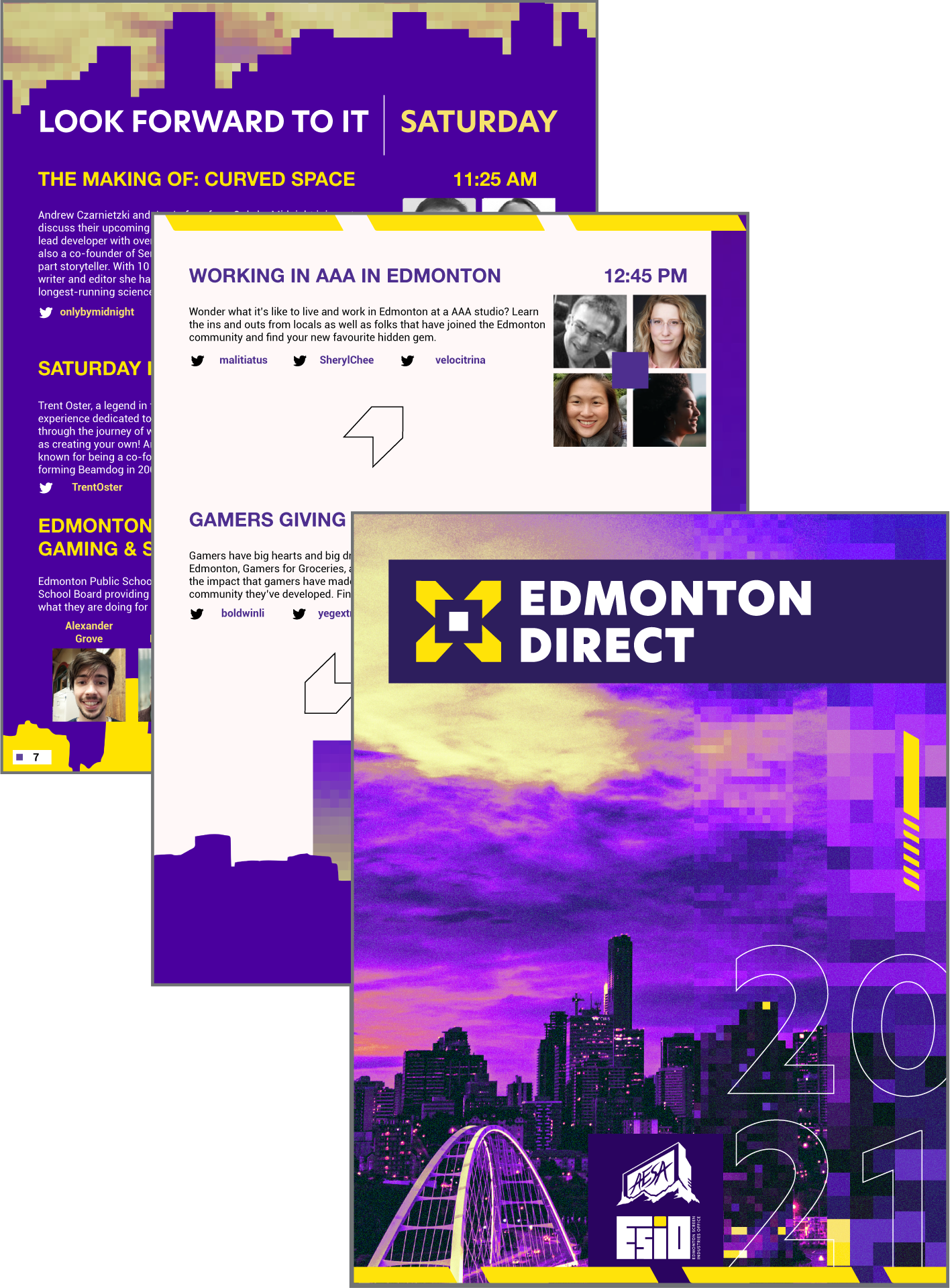
Edmonton Direct features Albertan talent in the games industry and enables conversation, innovation and interest within the community. Designed and inspired by Nintendo Direct online, a longer pre-recorded broadcast plays over a couple days featuring talks with some of the best in gaming close to Alberta. The Edmonton Direct guidebook was designed as a guide to the digital broadcast event and to act as a form of keepsake from the event for those who would receive a physical copy and features a myriad of visuals and content aligned with the Edmonton Direct brand.view online here
Edmonton Direct 2021 Guidebook
tgs outpost:
vancouver fan expo 2022
TGS Esports pops up at FanExpo
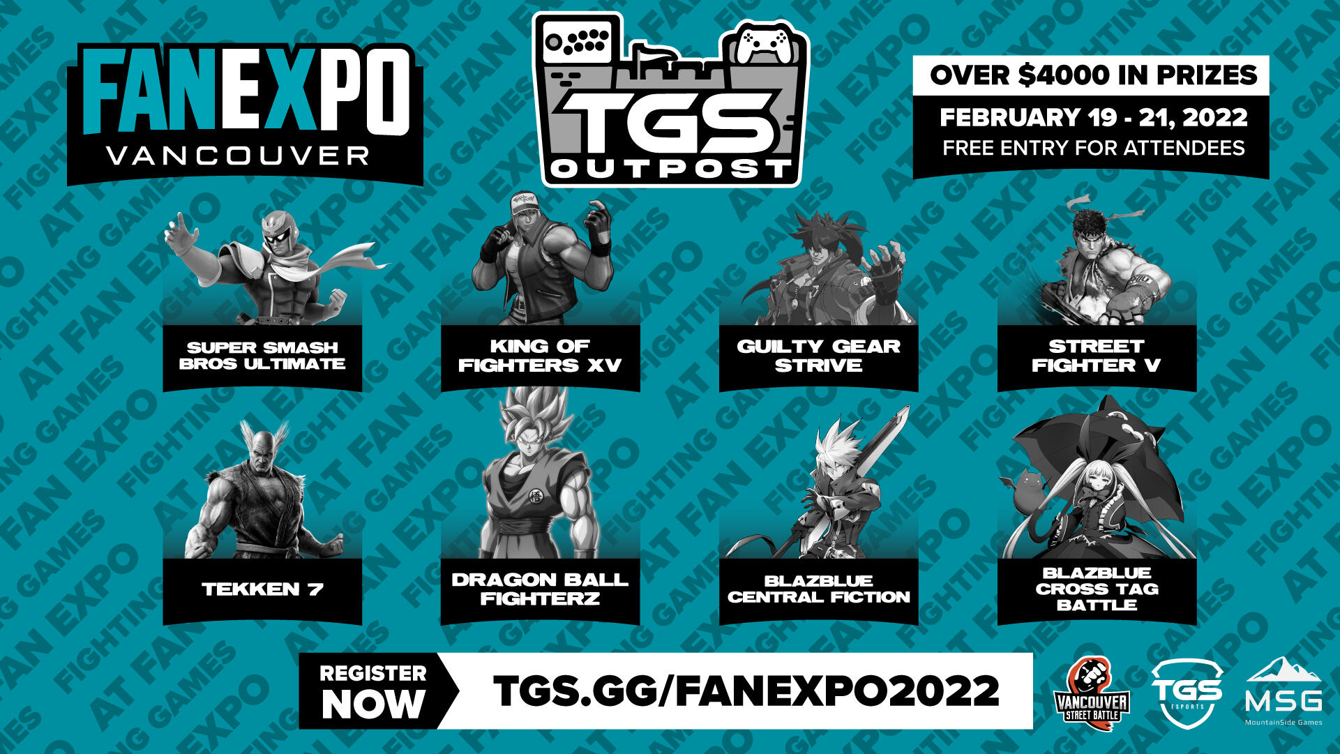
FanExpo Vancouver invites TGS Esports to appear at FanExpo Vancouver! The TGS Outpost forms as a sub-brand set in the Vancouver Convention Centre hosted by Vancouver Street Battle and Mountain Side Gaming. Branding is indicative of what convention-goers and gamers could expect from the outpost: a casual gaming experience with an emphasis on fighting gaming tournaments. TGS Esports take on the identity of FanExpo Vancouver 2022, adopting the color palette given to this convention activation.Final deliverables included branding guidelines, event graphics, social media promotional content, content addons, modified TGS Esports broadcast assets including animated visuals and completed showbuild as a VMix stream asset.watch here
TGS Oupost @ FanExpo Vancouver 2022
podcast: pixel scouters
fanfitgaming talks everything games
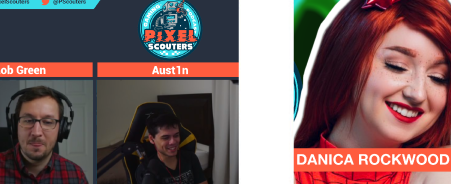
The podcast for gamers, by gamers featuring the creator and founder of Fanfitgaming. Rob Green and his sidekick Pat O’Reilly discuss gaming topics with subject matter experts regarding day to day life and gaming interests. Varying guest influencers and creators would discuss: gaming, cosplay, streaming, esports journalism, and more.Weekly deliverables for the podcast included, but were not limited to: post production, YouTube thumbnails, podcast streaming thumbnails, content SEO, broadcast overlays, edited visual segments and general consultation.watch here
Pixel Scouters Episode 8 ft. Danica Rockwood
hyperx hockey challenge
star show matches in an online nhl tournament
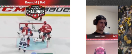
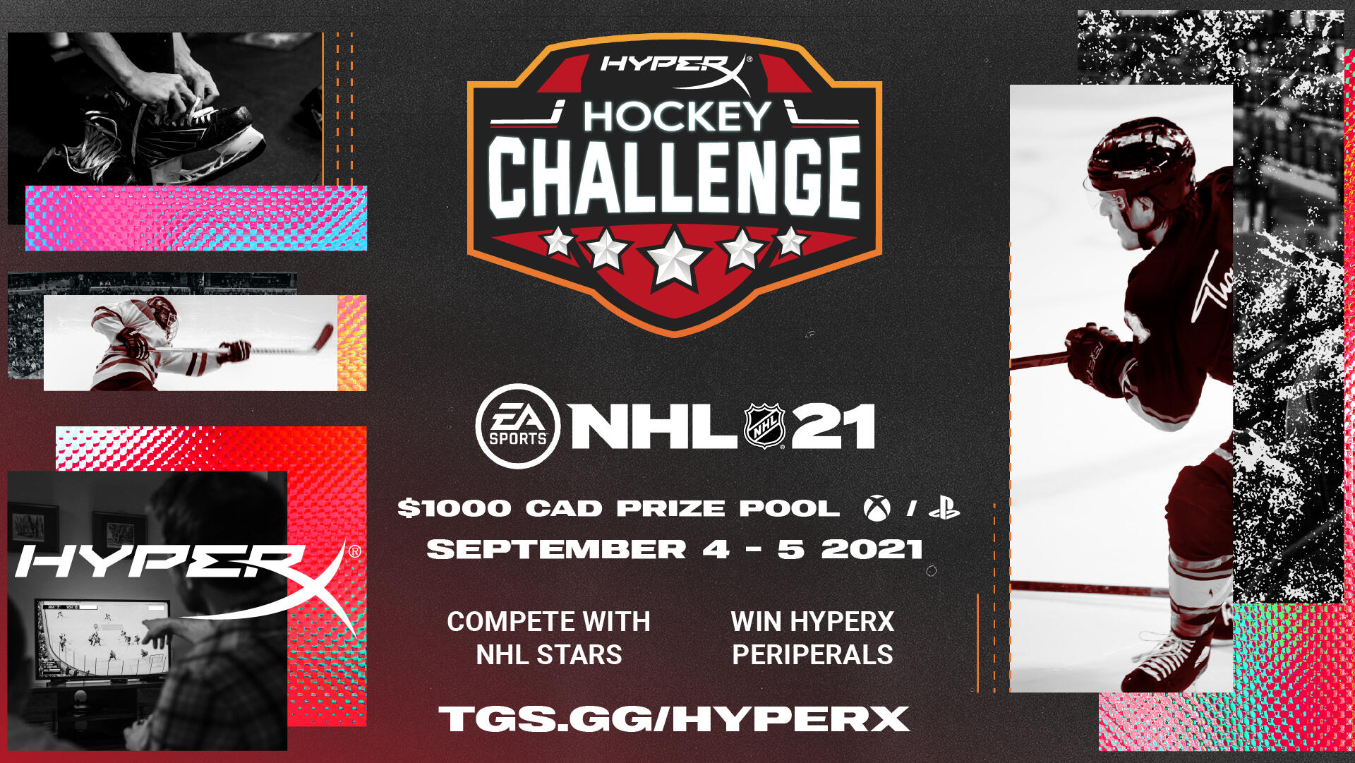
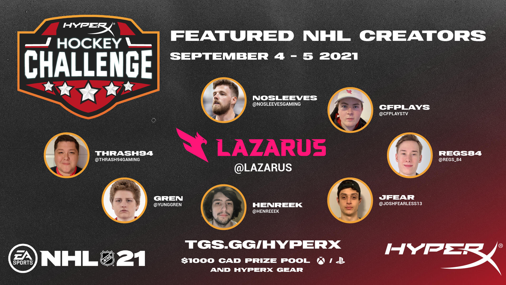
HyperX presents the HyperX Hockey Challenge in partnership, and in collaboration, with TGS Esports. Featuring show matches between NHL professionals both online and offline, as well as a community tournament to follow. The developed identity of the HyperX Hockey Challenge was to convert the HyperX brand to an adapted, inspired, iteration of the NHL 21 promotional aesthetic: strong colorful cropped textures, colored corrected photo manipulation, smaller decorative details and a bold mix of typography. Broadcast assets featured a unique holographic animated loop to create a visually engaging viewing experience.Final deliverables included branding guidelines, tournament graphics, social media promotional content, content addons, broadcast assets including animated visuals and completed showbuild as a VMix stream asset.watch here
HyperX Hockey Challenge Recap
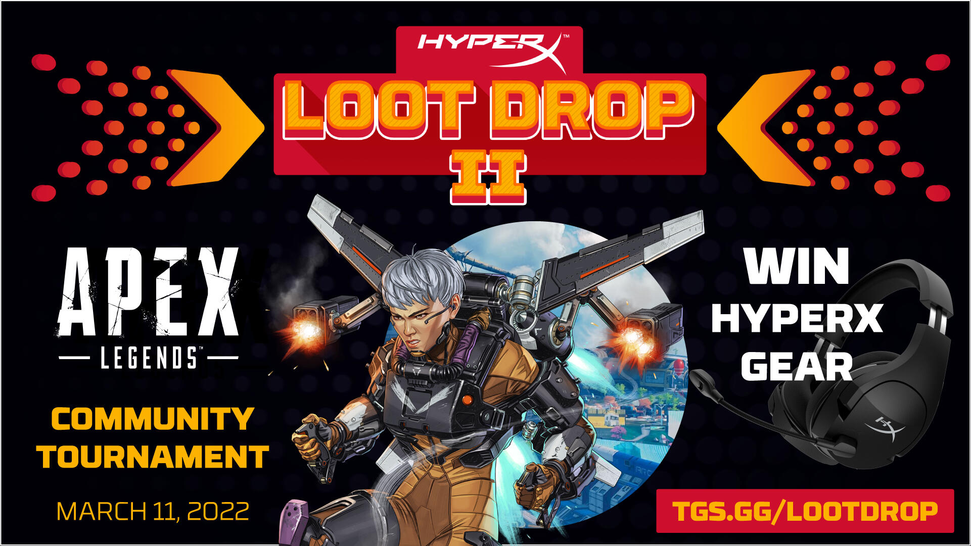
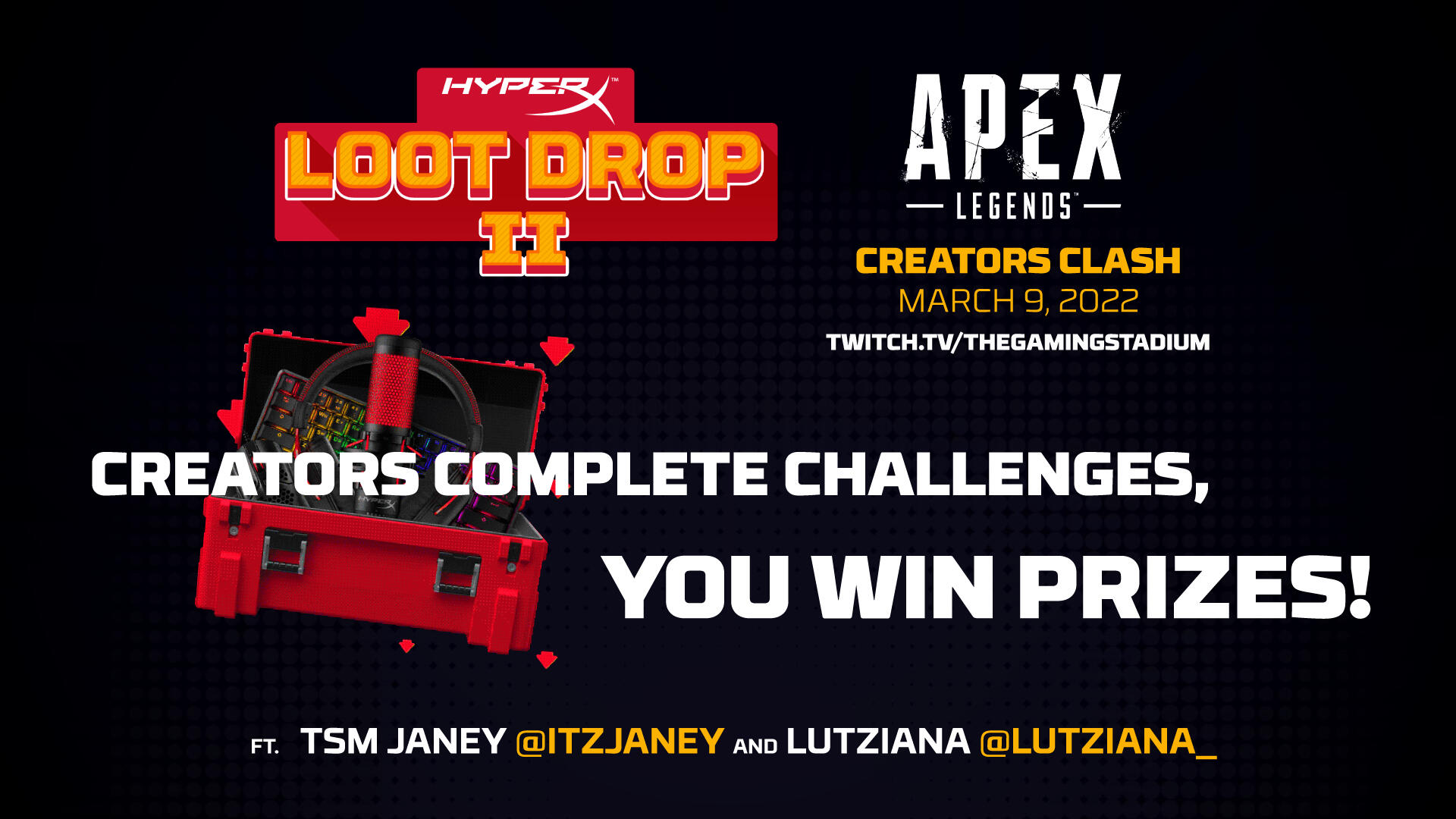
hyperx loot drop ii
leveling up the gaming sale experience
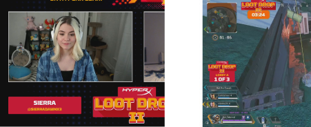
HyperX’s popular sale returns for a second iteration: Loot Drop II. In partnership with TGS Esports, the sale is promoted with a weekend Apex Legends tournament series: Day 1 Creator Clash and the Day 2 Community Tournament. Day 1 challenged a pair of Apex Legends influencers to complete challenges to unlock giveaways for their community. Day 2 featured unique broadcast elements that would countdown for chat loot drops, giveaways, within each hour.Final deliverables included designs for tournament graphics, social media promotional content, custom content addons surrounding Loot Drop mechanics, broadcast assets including animated visuals and completed showbuild as a VMix stream asset.watch here
HyperX Loot Drop Apex Legends Tournament 2022
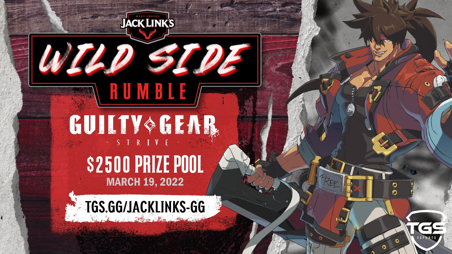
Jack link's wild side rumble
presenting a traditional brand to an esports audience
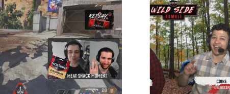
Jack Link’s partners with TGS Esports, bringing a series of esports tournaments in 2022. Wild Side Rumble features three games: Apex Legends, Valorant and Guilty Gear Strive. Bringing the Jack Link’s brand would entail the study and understanding of the ethos that is traditional to the Jack Link’s brand: honest, authentic, an expression of American outdoors, family traditions and originating from mom and pop on the farm. Visuals of wood grains, textured paper rips, painted or blotted wood paints would craft the esports brand of Wild Side Rumble. Character game assets that would convey the Jack Link’s brand best are utilized to invite gaming to the traditional Americana aesthetics. Background visuals of black and white worn photos constructed of in game screenshots embed beneath the wood grain to allow a feeling of memorabilia.Final deliverables included branding guidelines, tournament graphics, social media promotional content, content addons, broadcast assets including animated visuals and completed showbuild as a VMix stream asset.watch here
Jack Link's Wild Side Rumble: Guilty Gear StriveJack Link's Wild Side Rumble: Apex Legends
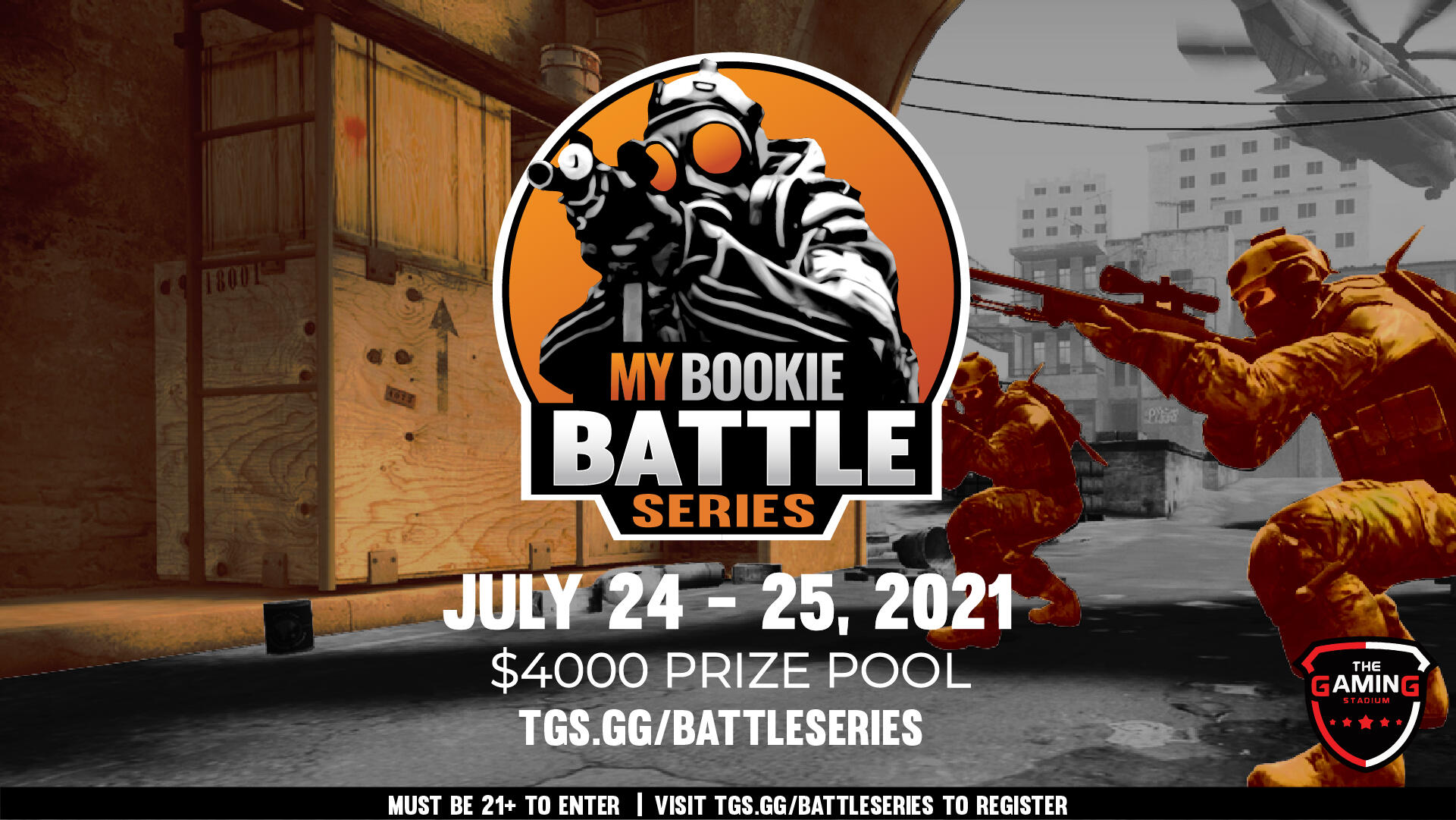
MyBookie Battle Series
battling beyond betting: a csgo series
MyBookie enters esports in a big way with the MyBookie Battle Series hosted by TGS Esports. Battle Series consisted of three Counter Strike: Global Offensive tournaments primarily as a North American event. Adapting the color palette and general design principle from the MyBookie brand would equate the esports identity for Battle Series: desaturated game screenshots with highlighted oranges, and an emphasis on integrating the MyBookie brand into notable CSGO community icons. A custom minimal gameplay overlay was adapted to further the sleek MyBookie experience within the tournament series.Final deliverables included branding guidelines, tournament graphics, content addons, MyBookie marketing content, broadcast assets including animated visuals and completed showbuild as a VMix stream asset.watch here
MyBookie Battle Series Highlights
guide book:
salt flats 2021
celebrating gaming with a local community
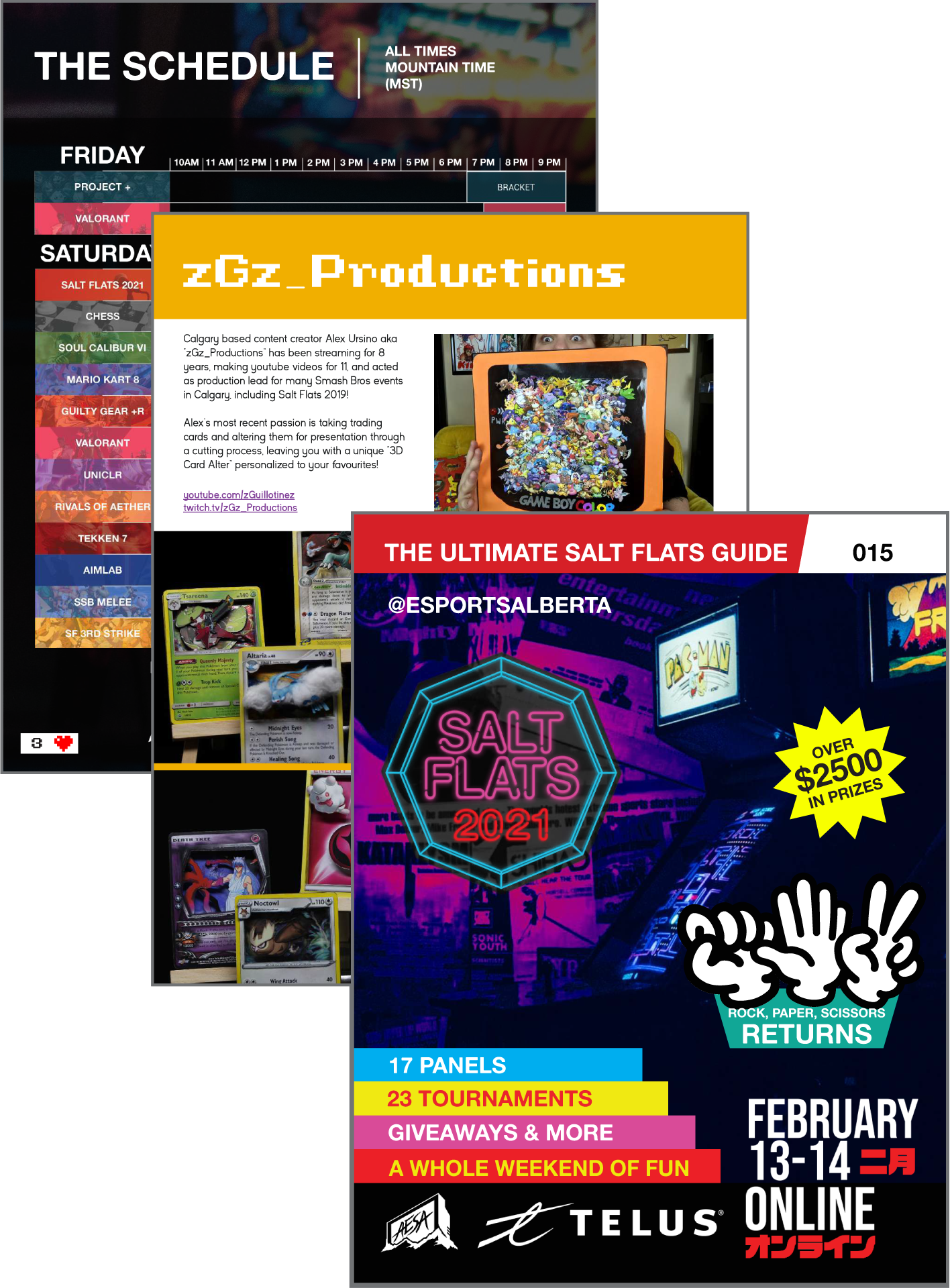
An event guidebook that celebrates the history of the Salt event legacy local to Calgary, Alberta. This same fighting game series went online when the world locked down. To provide a sense of coming together as a community within an online space, the Salt Flats 2021 Guidebook was distributed digitally and physically to attendees and tournament participants that would have it: a piece of memorabilia close to the local Calgary esports scene.Event branding and identity would take neon, approach within its retro aesthetic as a celebration of arcade gaming into the modern era. This aesthetic celebration of classic gaming would enable a guidebook design that would appear as a retro game guide would.view online here
Salt Flats 2021 Guidebook
TGS Speedrunner Series
by Shaw
Lifting speedrunning into the esports space
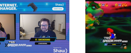
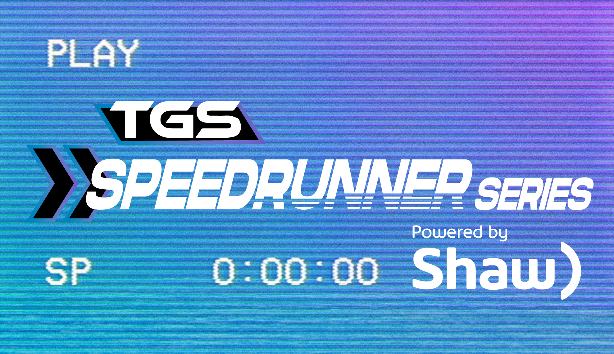
A celebration of speedrunning powered by Shaw, hosted by TGS Esports. The TGS Speedrunner Series hoists speedrunning further into the esports space with a series spanning over a month. Speedrunner Series featured: introductions to speedrunning, speedrun showcases, tournaments and head to head influencer matches across a variety of speedrun favorite games. Creating the TGS Speedrun Series branding would require the integration of Shaw branding with general design principles of TGS. Blue and purple gradients with traditional television distortion would invite the Shaw identity to create a speedrun community aesthetic that thrives within a CRT era of visuals. Typography familiar to TGS Esports would be utilized with highlighted tones and colors to create an engaging collaborative experience between brands and community.Final deliverables included branding guidelines, tournament graphics, social media promotional content, content addons, broadcast assets including animated visuals and completed showbuild as a VMix stream asset.watch here
TGS Speedrunner Series 1 Powered by ShawTGS Speedrunner Series 3 Powered By Shaw
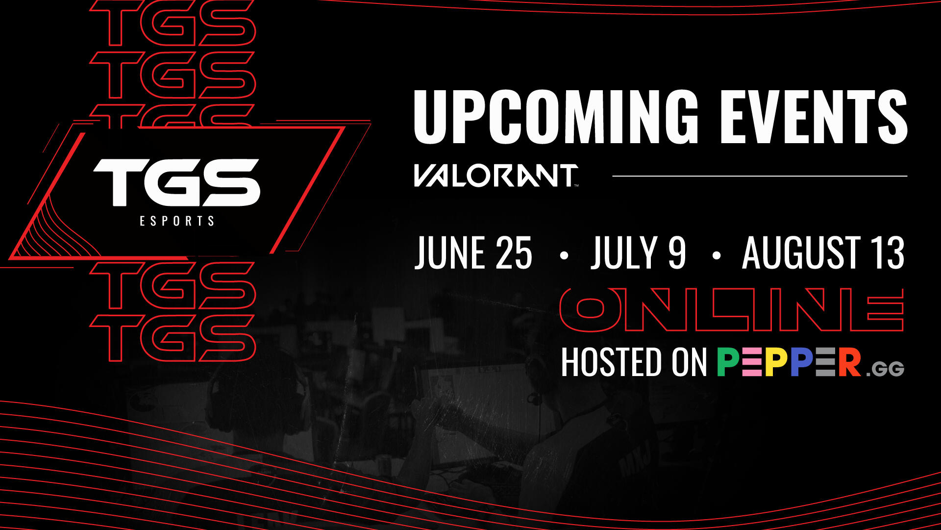
TGS esports 2022
tidy visuals for a new year
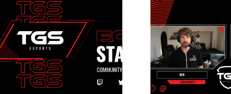
Refreshing the TGS Esports branding and moving above and beyond The Gaming Stadium. TGS Esports seeks to be recognized across North America and onwards taking on a more modern contemporary approach to its aesthetics within the esports space. Energetic, vibrant, playful and flavourful, the new visuals of TGS Esports crafts an experience through patterning, movement, experimental considerations of hierarchy and use of space. Placed are two lesser icons: a directional circle and a world with a ring indicative of TGS Esports being capable of being anywhere, in any direction, across the globe offline and online. Typographic choices are grandfathered from The Gaming Stadium brand and further reinforced and accompanied by a bold grotesk title font to attune the brand to current esports trends.Current delivered products within the TGS Esports refresh are broadcast assets including animated visuals, a refreshed look book and brand identity, general TGS Esports assets, graphic templates and social media assets.see site refresh here
TGS Esports Site Design
TGS esports site design
a brand refresh requires a new look
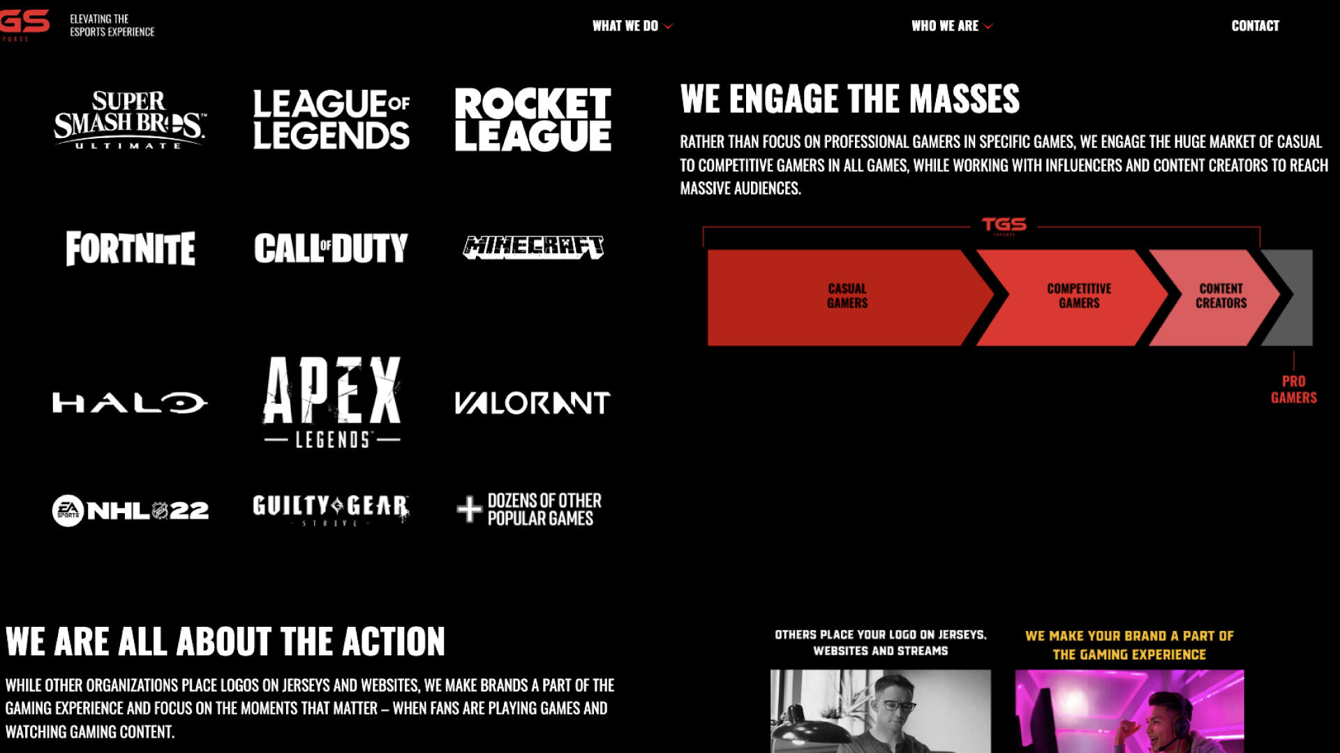
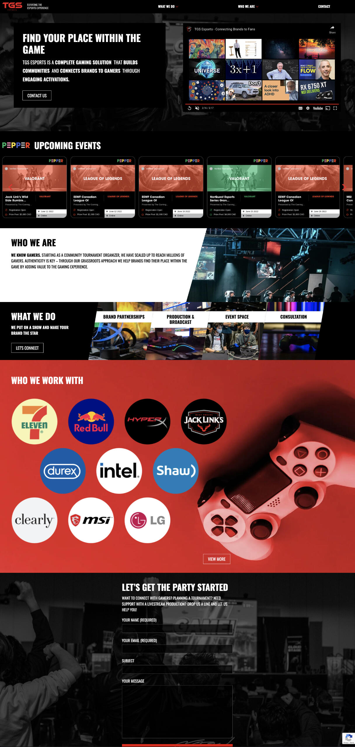
Transitioning from The Gaming Stadium to TGS Esports, a new site was in order to round out a brand refresh. Communicating new objectives, business direction, culture and discussing TGS Esports as the all in one gaming solution; elevating the esports experience. Pepper as a tournament organizing brand of TGS Esports is showcased front and center with a rotation of ongoing, available esports tournaments. TGS Esports highlights the store of who, what, why in a vibrant, new aesthetic and eloquently scrolls to a call to action: let’s get the party started, contact us.Completed product of the site design included, but were not limited to: redefined site map, complete desktop site design, curated event or gaming icons and photography, other imagery curation, definitive branding guidelines and general design consultation.see here
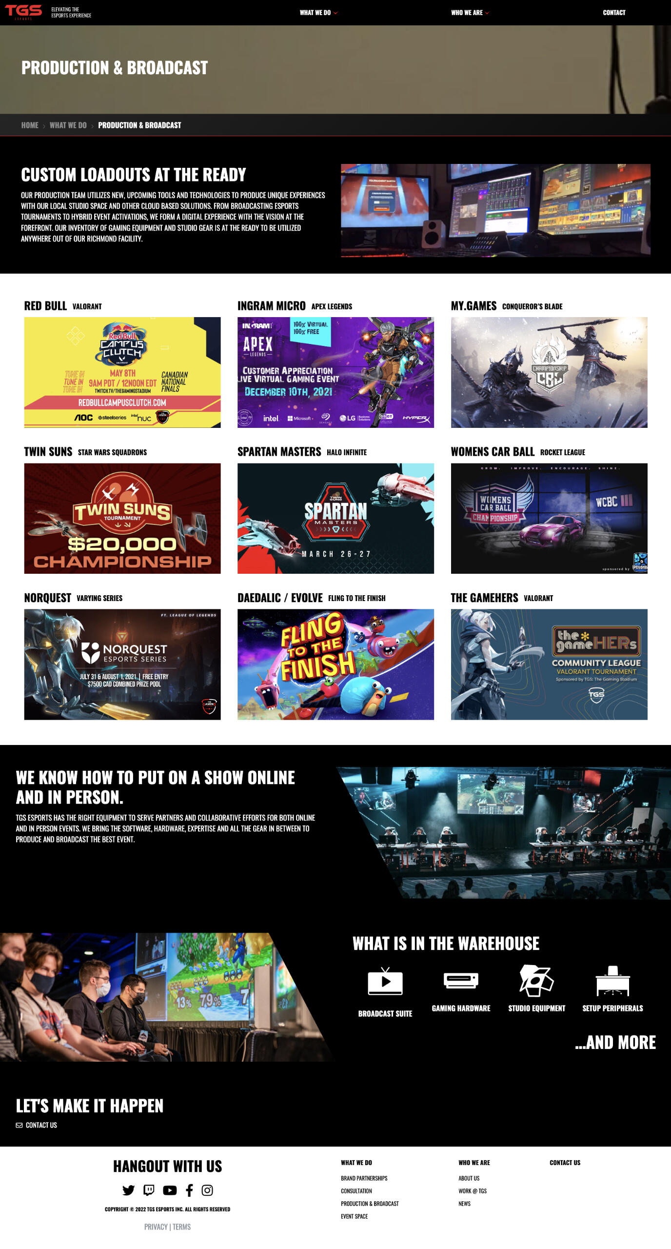
TGSesports.gg
shopify rebellion show match
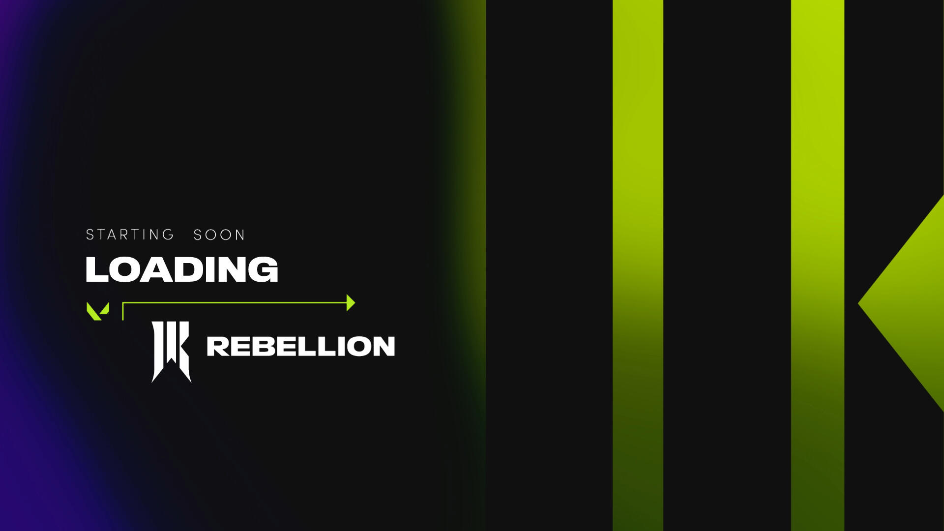
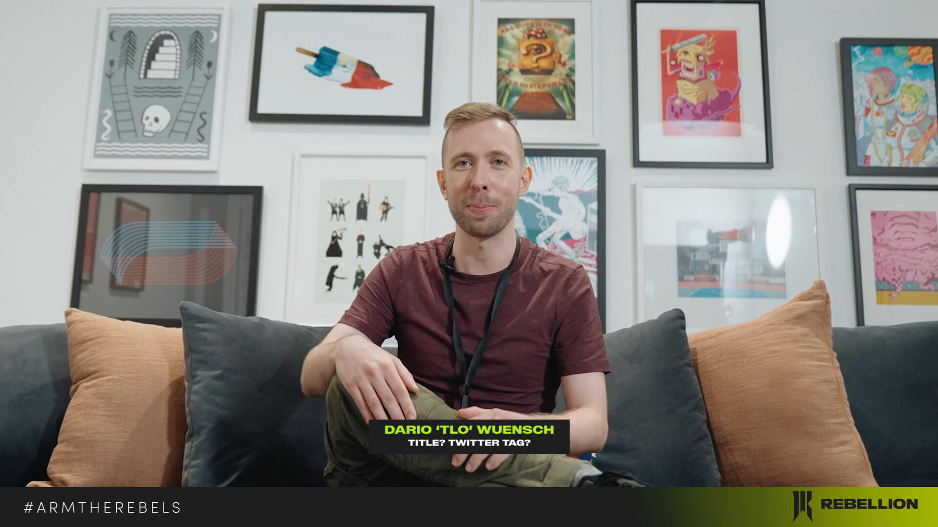
arming shopify rebellion with new stream visuals
Refreshed stream overlays and broadcast assets for Shopify Rebellion. In May 2022, the rebellion welcomed the Luminosity Gaming Valorant roster. Following the announcement, Shopify Rebellion hosted a special show match event featuring a mix of the womens and mens Valorant roster: team Peanut Butter featuring Lorri, Bdog, Benita, Dazzlo and Sonder versus team Monkey Business featuring Flowerful, Mada, Tigg, KP and Moose.Aligning with the 2022 visuals and brand of Shopify Rebellion, developed streamed assets refreshed the aesthetic with smooth animations and a contemporary approach to the creative process. Completed package included designed broadcast assets set in a VMix showbuild of operation.#ArmTheRebels
battle box gaming trailer
gaming on the go with battle box
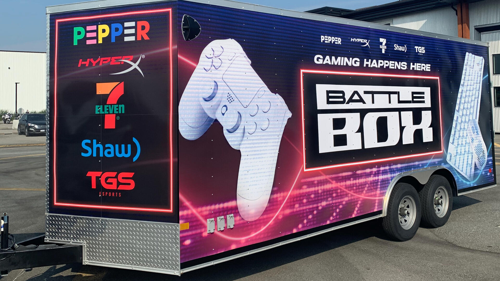
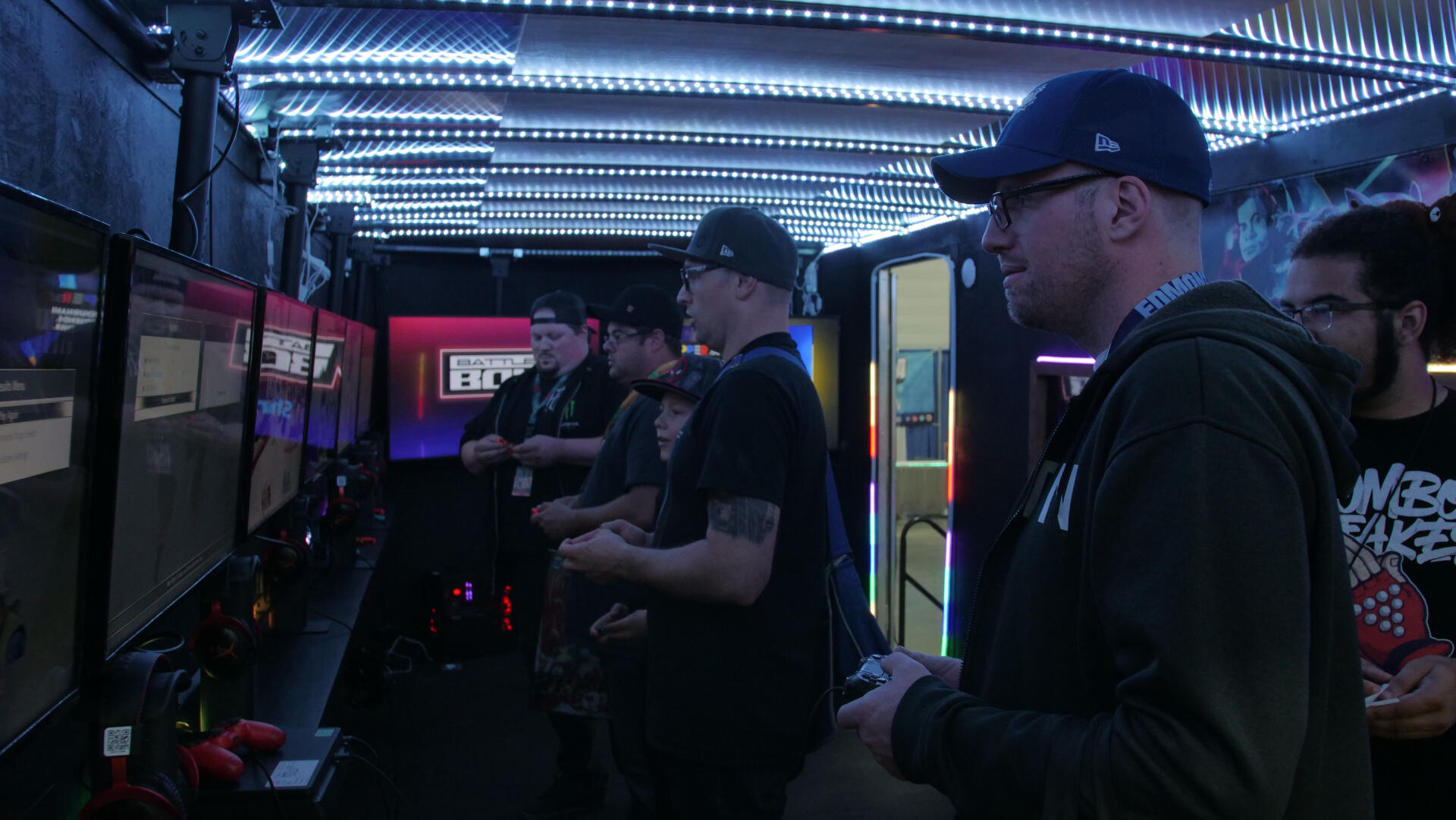
The esports and gaming experience hits the road in Canada! On behalf of TGS Esports and various partners, the Battle Box brand comes to life. Taking inspiration from a synthy 90s retrowave aesthetic, the logo adapts the timeless visuals of the 5th console generation adorned by CRT scanlines and emulated neon lights. GAMING HAPPENS HERE as demonstrated by the designed x-ray side panel featuring a look into the trailer with guests and gamers alike battling away in their console of choice. Controllers and keyboards hang loose on the printed back panel to hint at the exciting gaming experience to be had inside. A place for all to game: Battle Box is placed on show floors, posted at festivals or concerts or hanging around the afterparty. Developed exterior and interior mockups would generate the final creative vision in crafting and operationalizing a cohesive gaming experience.Final deliverables included branding guidelines and exclusive logo designs for merchandising, designed visual mockups and unique exterior wrap printables.Gaming happens here.
commonwealth esports:
team canada jerseys
representing canadian talent on the global stage
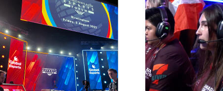
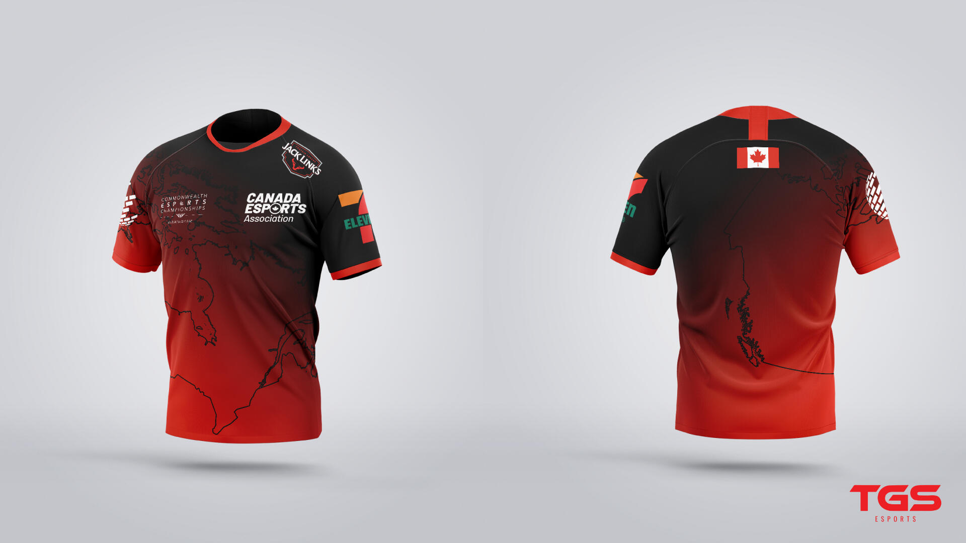
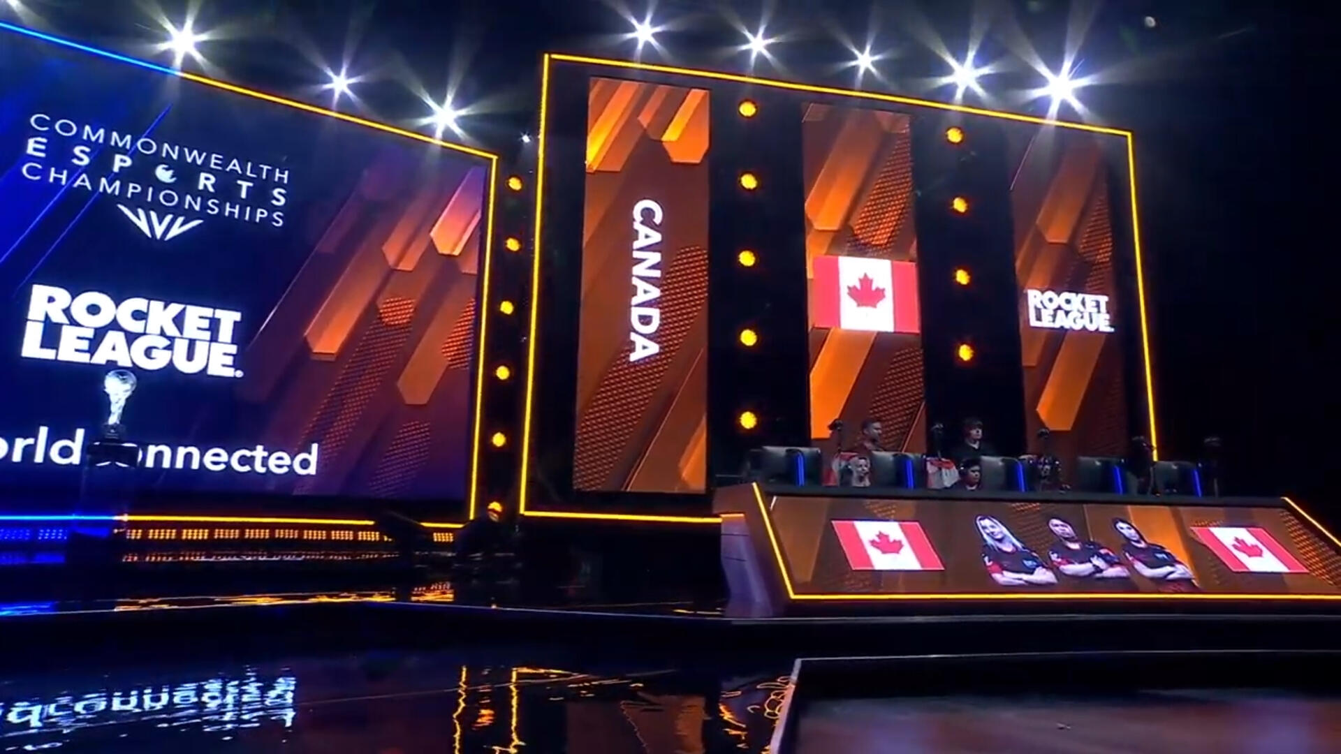
The definitive Canadian Jersey representing Team Canada at the 2022 Commonwealth Esports Championships: featuring the best international talent in Fifa, Rocket Leauge and Dota 2. Representing Canada in Birmingham, presented by Canadian Esports Assocation and TGS Esports, is the Open Team and the Women’s Team for Rocket League. A red to black gradient to create an esports visual that invites the traditional Canadian red. Across the jersey: the map in Canada as an all encompassing emblem of an expansive, diverse country and its collective commitment to performing on the world stage. Upon the presenting sponsor and partner logos: a Canadian flag resting at the nape of the neck as a point of unison and pride in chasing the gradient throughout the jersey.Canada in Birmingham would solidify its presence as a pleasantly fierce force with the Women’s Rocket League team making it to the big stage for Day 2.Go Team Canada!watch here
BBC Sport Interview with Comp and MushCommonwealth Esports Championship - Birmingham 2022Commonwealth Esports Championship - 2022 Group Stage Canada vs India (Rocket League)


